Whitney Port Bathroom Renovation Reveal
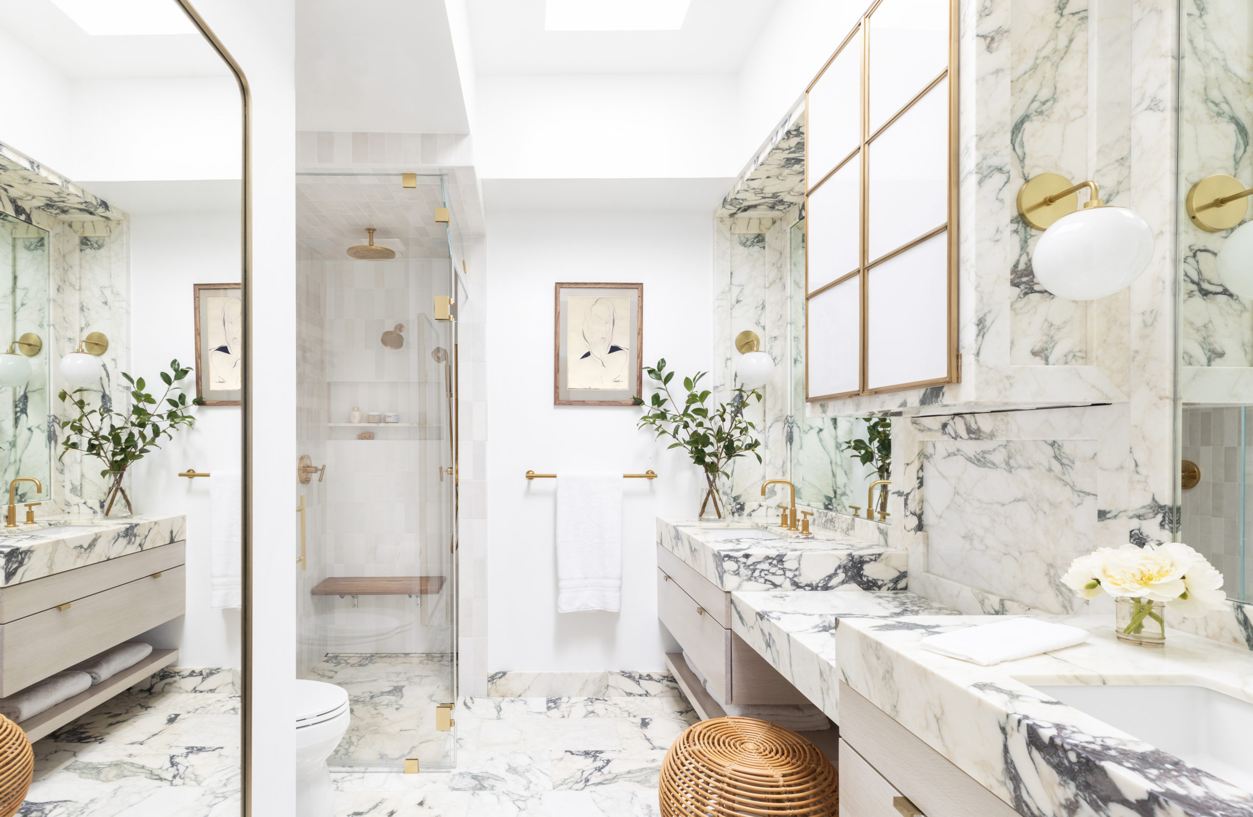
We are so excited to share all the details behind the bathroom renovations for our favorite style maven, Whitney Port! After designing her kitchen and outdoor spaces last year, we were thrilled to work with her again. She has a unique and beautiful sense of style and is always up for pushing the envelope. Read on for a behind-the-scenes look!
Whitney Port Bathroom: Functionality
First and foremost, it was crucial for the renovation to be functional. We were working within the previously constructed layout, so we looked for ways to add as much storage as possible. We brought in wall mounted shelving and opted for deep drawers instead of lower cabinets because they are easier to keep organized.
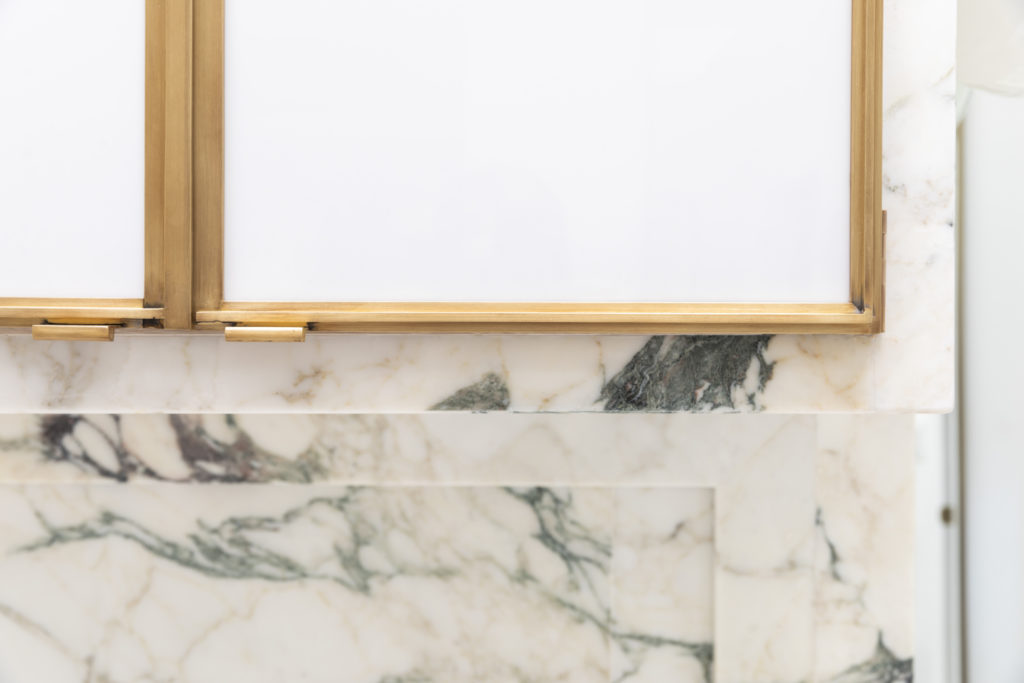
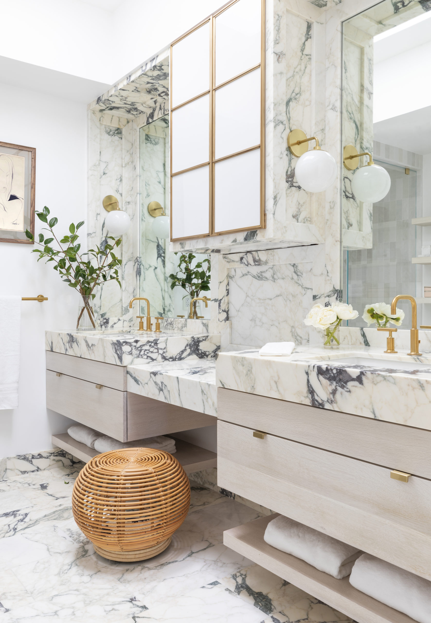
Shop: Light | Faucet | Towel Bar | Cabinet Pulls | Stone
Whitney Port Bathroom: Lighting
Next, we wanted to lighten up the space to make the bathroom feel larger. Task lighting and white washed rift cut oak drawers brighten up the once green and pink bathroom, and a full-length mirror strategically placed at the entry reflects additional light.
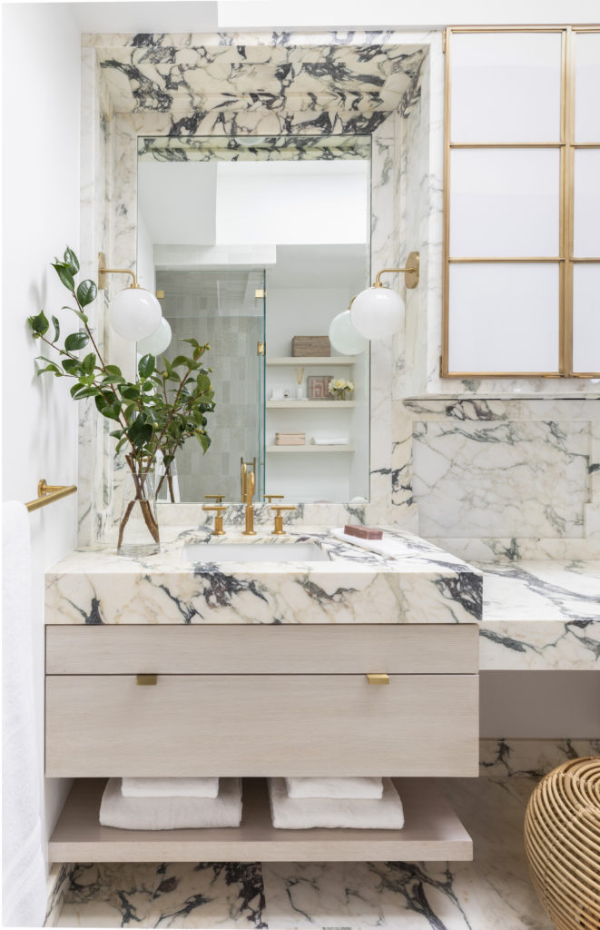
Shop: Light | Faucet | Towel Bar | Cabinet Pulls | Stone| Shower Tile
The vertically laid ceramic shower tile’s color variation complemented the tones found in the stone and cabinetry. Then we brought in the drama with this gorgeous Calacatta Paonazzo marble from Aria Stone that has the most exquisite deep purple and grey veining. Architectural interest was added by using inset paneling on the walls.
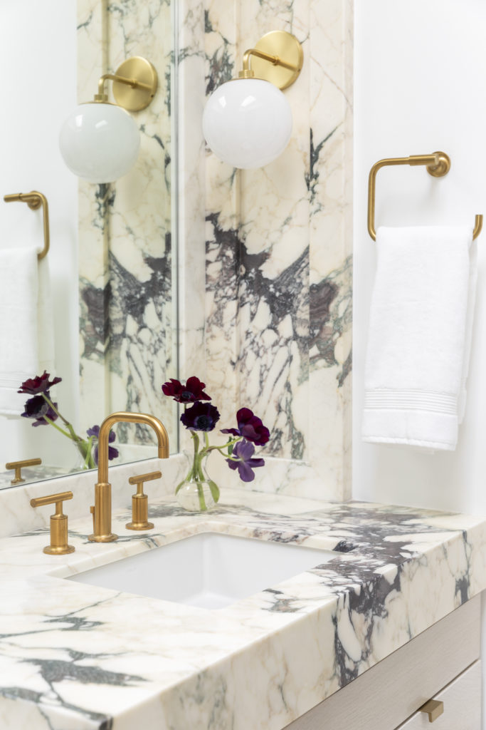
Shop: Light | Faucet | Cabinet Pulls | Stone | Towel Ring
Whitney Port Bathroom: Sonny’s Bath
Adding additional baths not only improves the function of your home, but it also increases the value. One of the most cost effective ways to build another bathroom is to strategically place them next to an existing bath, so you can tie into its plumbing. This is exactly how we converted extra closet space into a full bathroom for Whitney’s little boy Sonny.
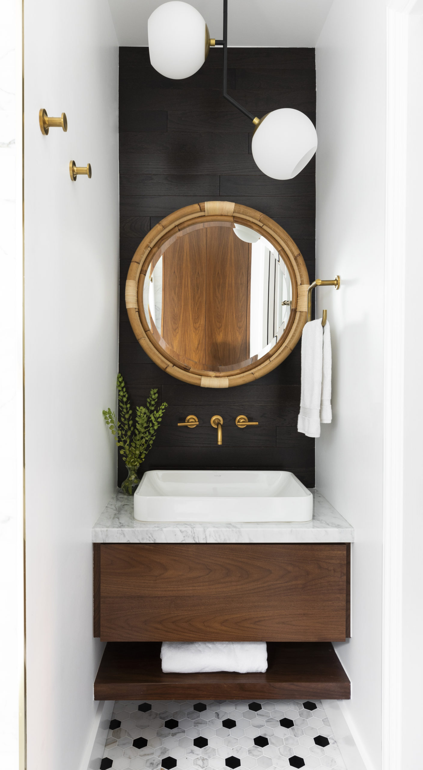
Shop: Mirror | Towel Pegs | Faucet | Light Fixture | Towel Ring | Calacatta Tile W/ Black Hex Mixed In | Paint
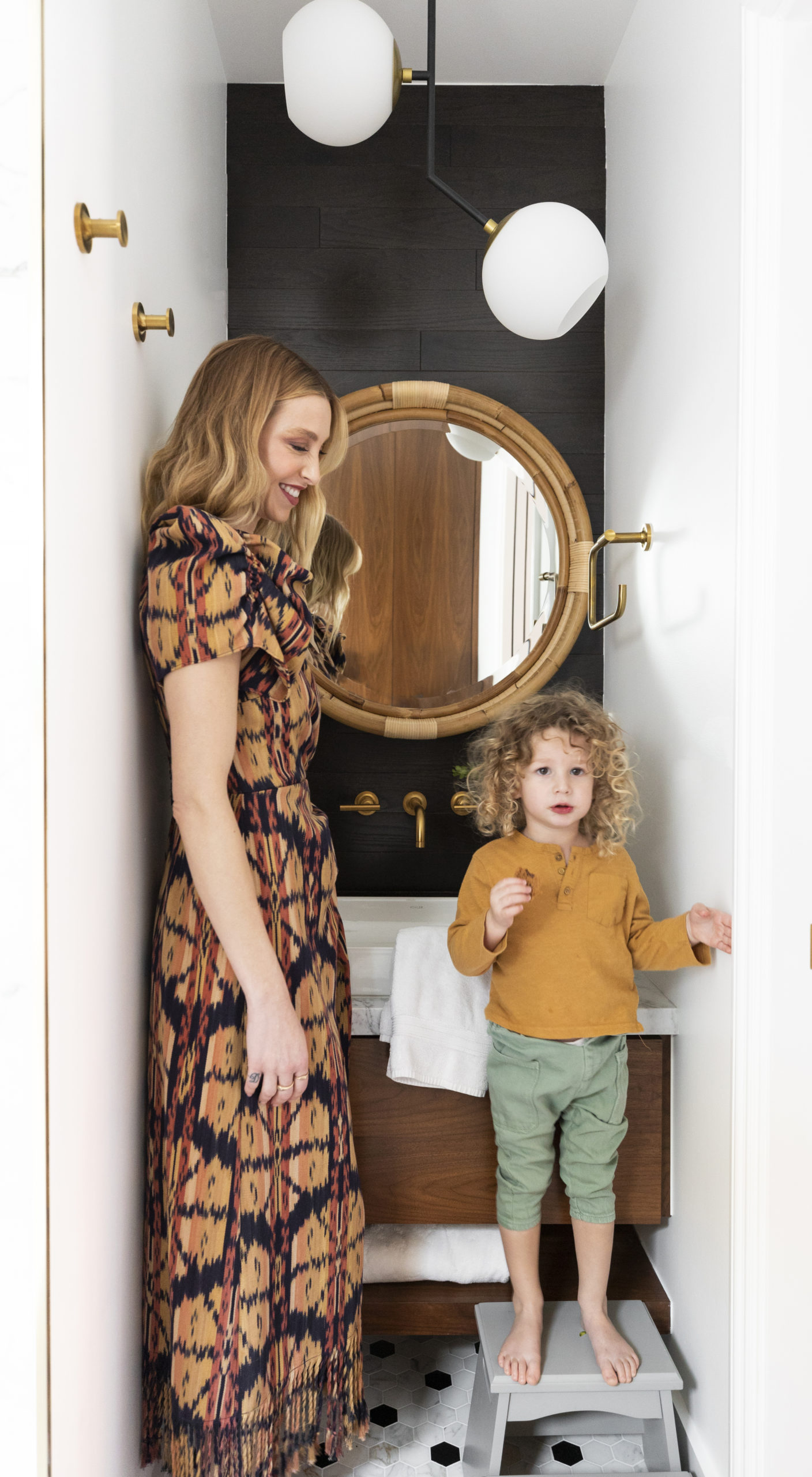
We were working with a small footprint so every inch counted. We added storage with a large pull out drawer, as well as built-in shelving over the toilet. You can forgo the traditional towel bar and use pegs to be able to hang more towels. A wall mounted-faucet also allows for additional counter space.
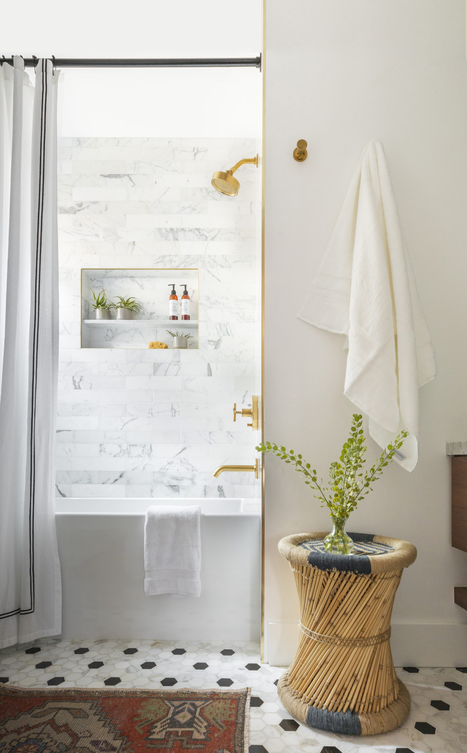
Shop: Shower Tile | Shower Head | Towel Pegs | Calacatta Tile W/ Black Hex Mixed In
When you’re designing in a confined space, the little details add so much texture and depth! We used a brass schluter strip to conceal the raw edge of the porcelain tile, which accented the brass hardware, then highlighted the vanity by bringing in black shiplap for a pop of fun. A drop down light fixture also plays double duty by providing overhead light and replacing the need for sconces.
Whitney Port Bathroom: Guest Bath
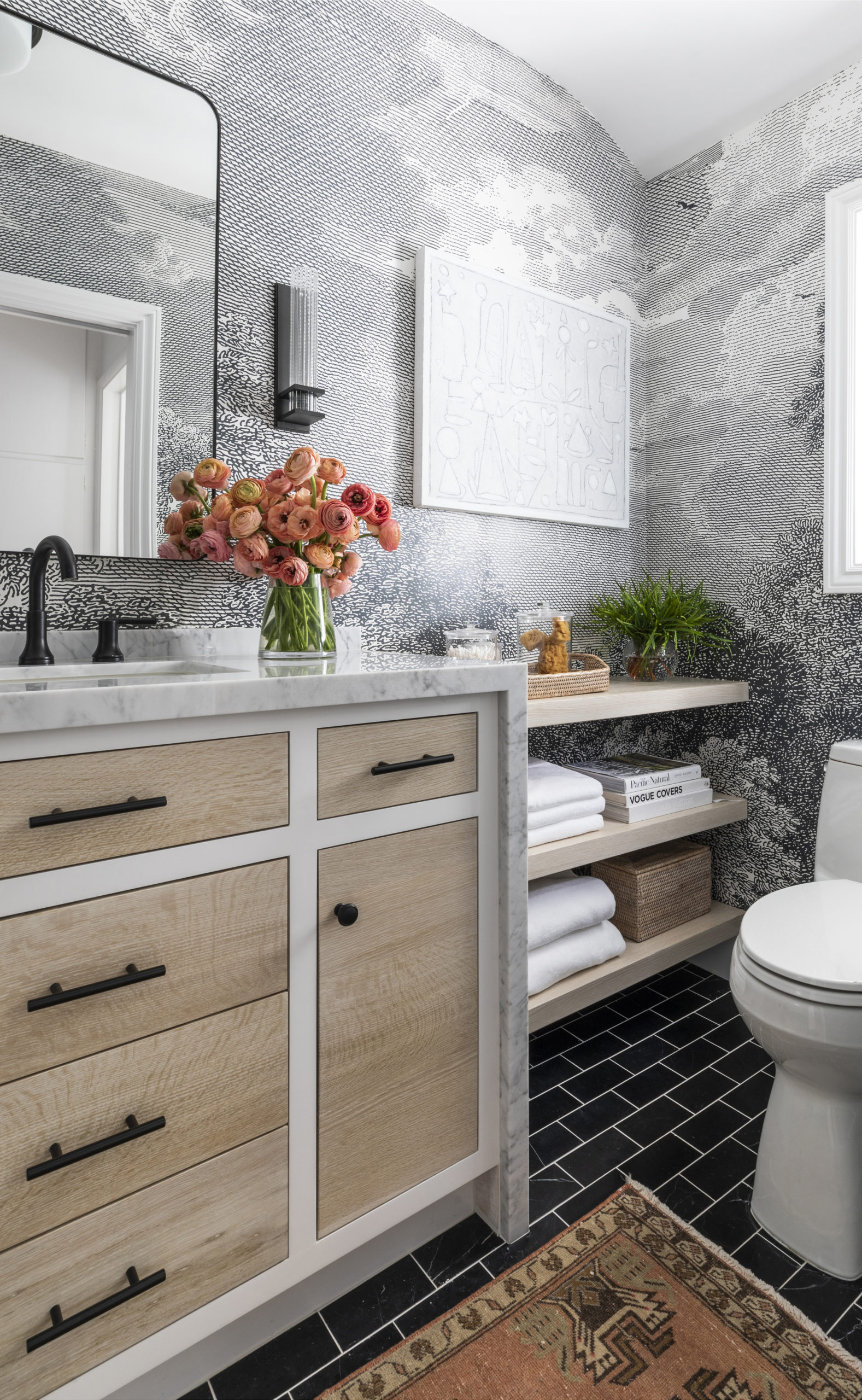
Shop: Mirror | Sconce | Drawer Pulls | Wallpaper | Floor Tiles | Stone Slab | Art | Faucet
Guest baths are the perfect place for a bit of novelty. The existing bath already had quite a bit of natural light, which allowed us to use darker accents without making the space feel over crowded.
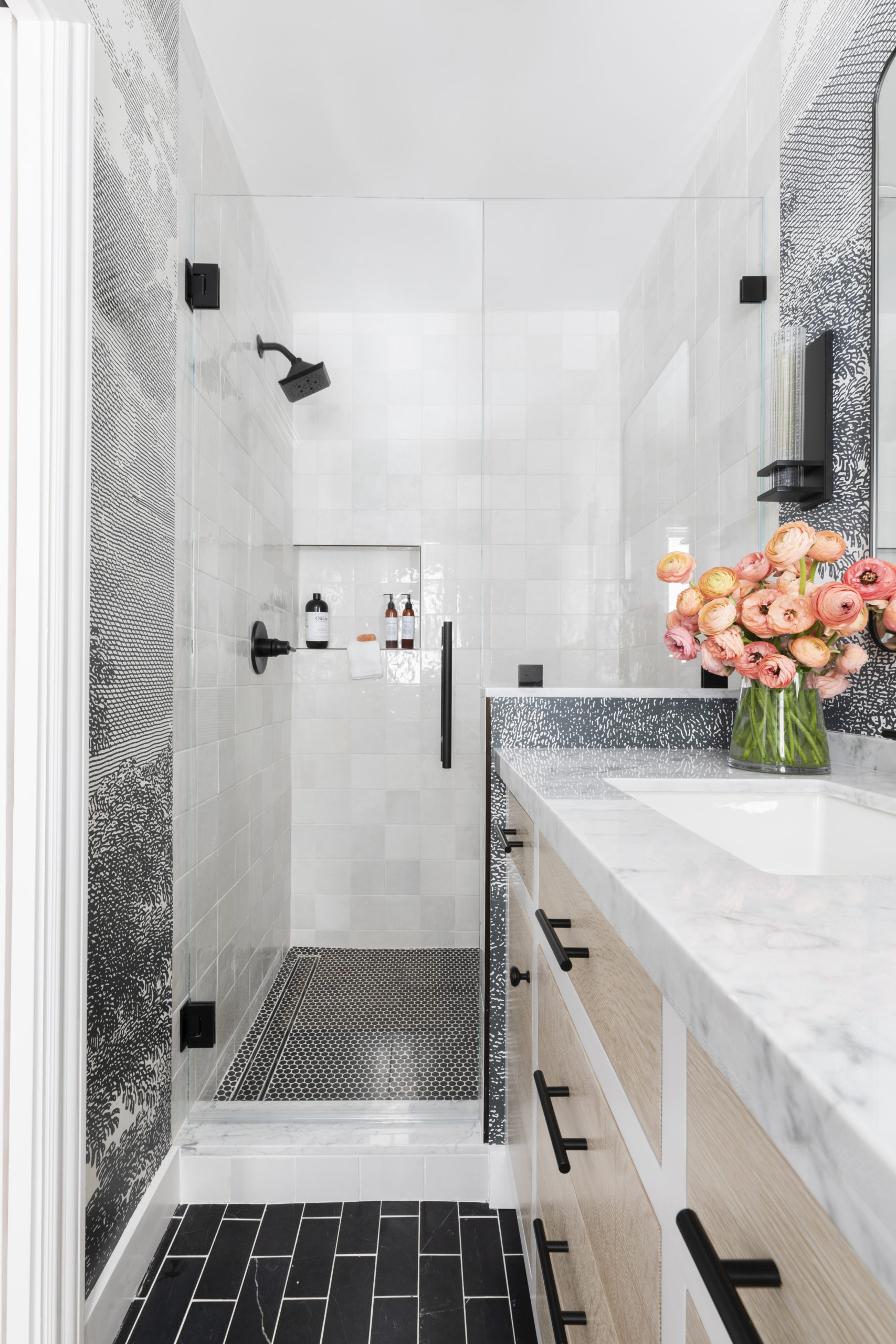
Shop: Sconce | Drawer Pulls | Wallpaper | Floor Tiles | Stone Slab | Shower Wall Tile | Shower Floor Tile
A monotone landscape wall mural served as the perfect backdrop for dark marble floor tile and square ceramic shower tiles.
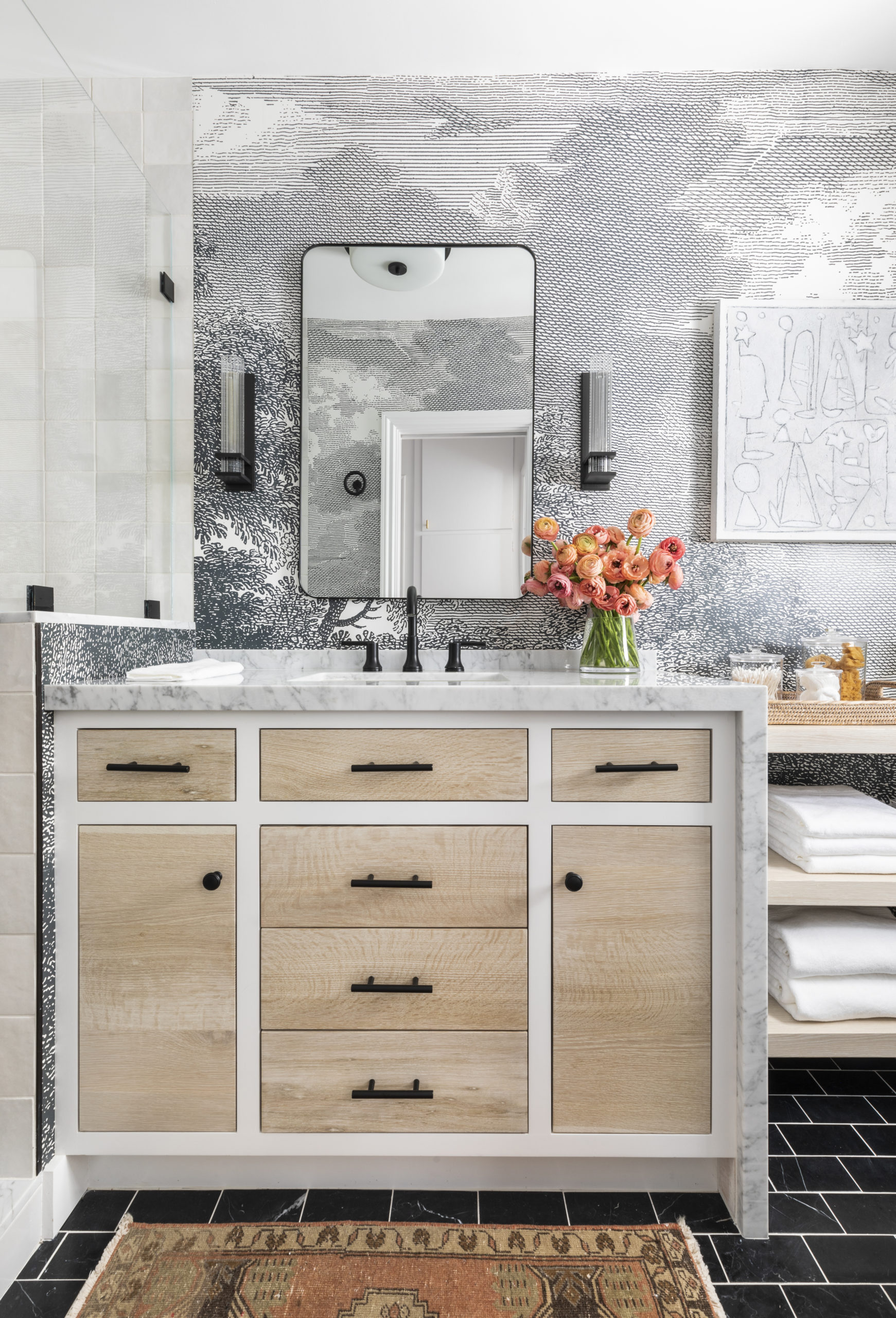
Shop: Mirror | Sconce | Drawer Pulls | Wallpaper | Floor Tiles | Stone Slab | Art | Faucet
White washed oak cabinetry and a rust colored oushak runner bring in a dose of warmth to the space. We also love how the white painted vanity allows the oak drawers to take center stage.
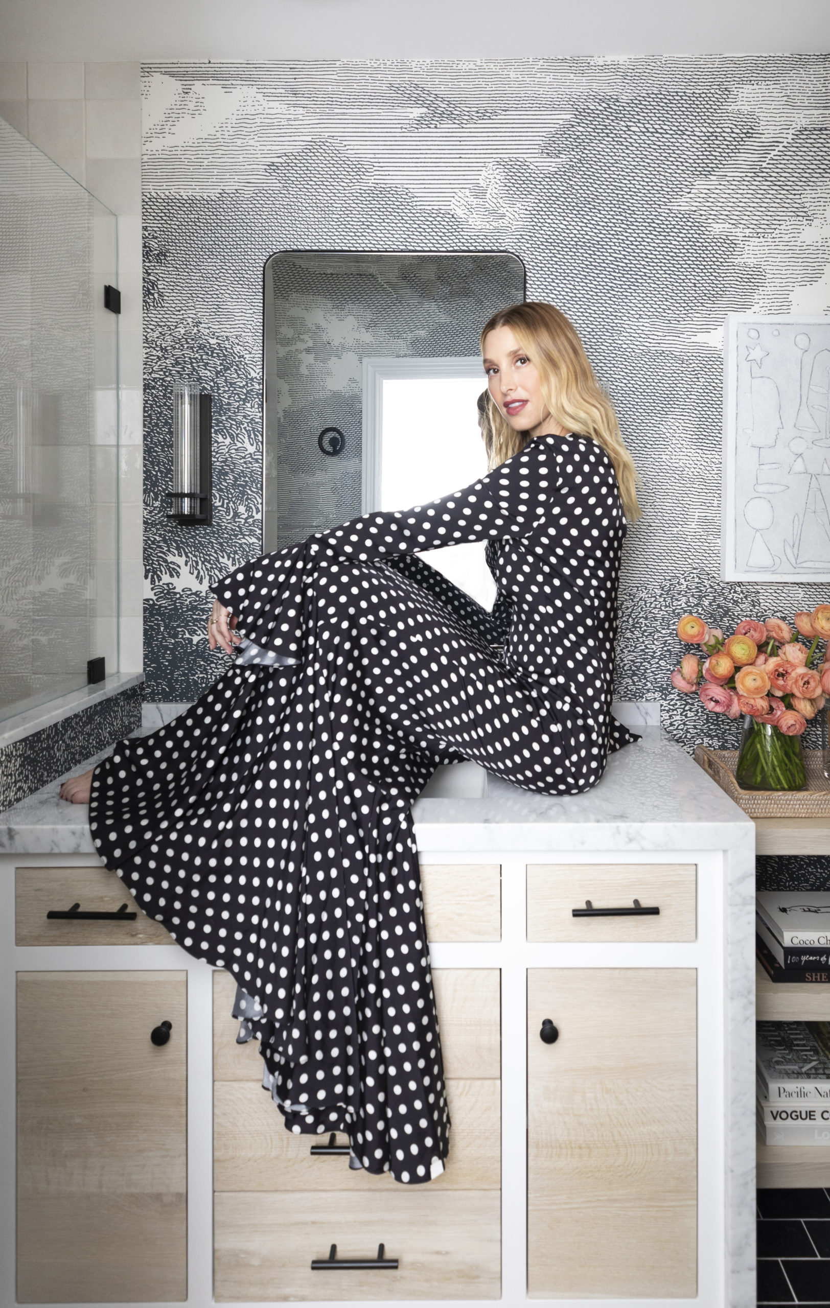
Want to see more before-and-after shots? Read this recent feature from Get Clever for more pictures along with Whitney’s take on the whole process!
Thank you so much!
[…] is always a classic choice and feels especially refined in a secondary space, such as a guest bathroom. Its drawers afford plenty of concealed storage for toiletries, a hairdryer, towels, and other […]
[…] the end of the day, we knew Whitney and her fam would prefer a natural stone that’s highly durable and easy to maintain which […]