#MyHouse Room Reveal, Part 3
FAMILY ROOM, GUEST SUITE & UTILITY ROOM
Tour number three! Are you ready to head upstairs? Today, I’ll show you our family room, guest bedroom, guest bathroom and the utility room. If you’re interested in exploring downstairs, you can find all the details here and here! Back to the tour. I’m excited to share some design tips and considerations I made for these spaces.
FAMILY ROOM
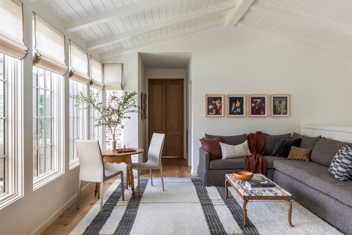
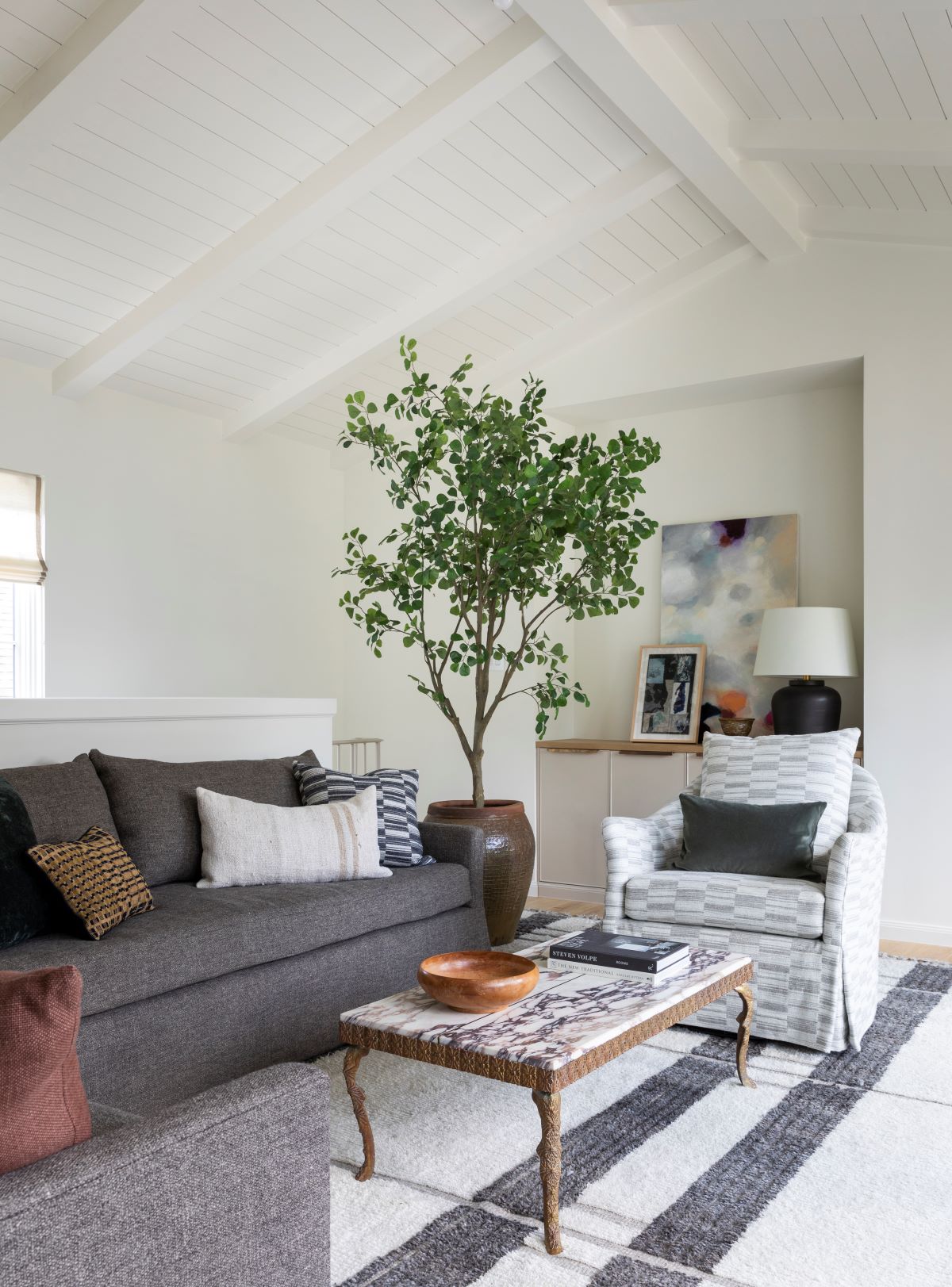
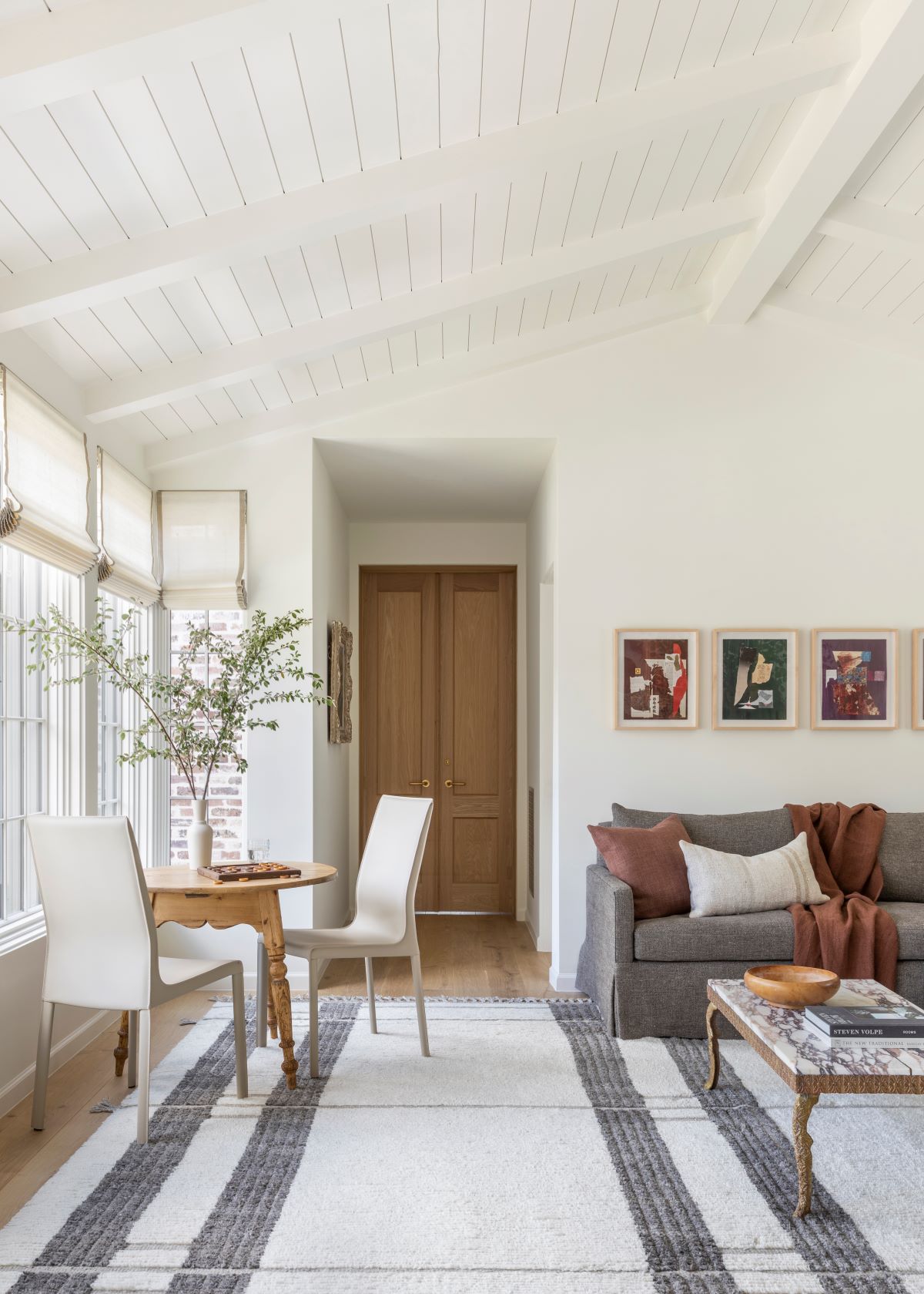
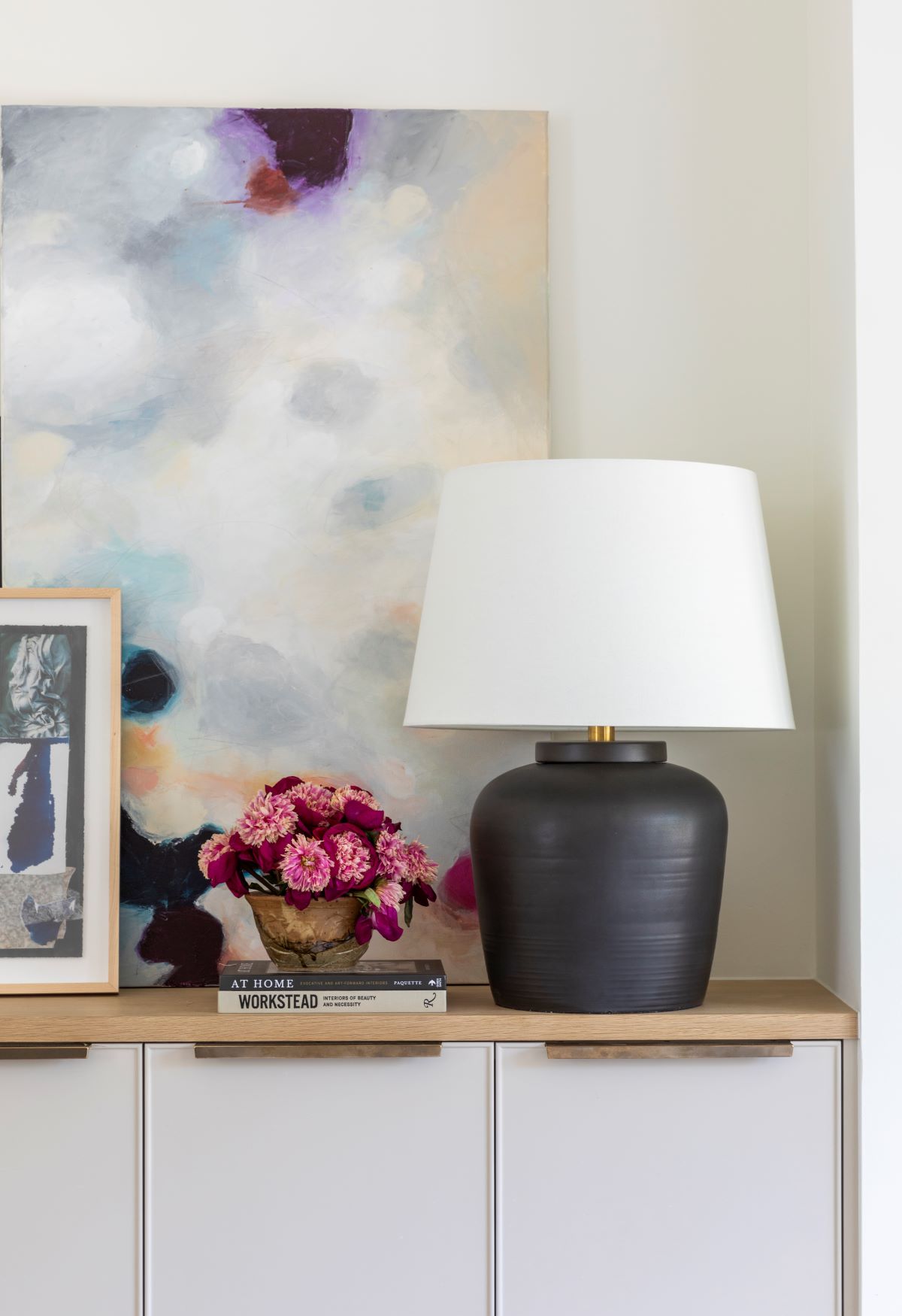
If you head up the stairs as seen in the second tour, you’ll hit the landing which is our family room. This is the room where we relax, watch television and play. There is a bank of cabinetry and an alcove immediately on your left that allows for storage and a place to mount the tv. So many of you are curious about the television situation and yes, now there is a tv where that piece of artwork is located. The just across the way is a custom, oversized sectional where we enjoy movie nights and time to chill. I chose a dark Mark Alexander fabric for this sectional because…you know, kids!
You’ll notice the vaulted, slatted roof detail, which gives the home added character. I love the Everett rug for the added softness underfoot and the fact that it makes this totally open space feel intentional. Per usual, I was adamant about harnessing natural light. The bank of eastern-facing windows was very important for enjoying gorgeous morning rays! I love waking up and having the sun streaming through the room as a start to my day. These shades are another custom weave by Hartmann & Forbes. I love the taupe edge detail that was added. I knew I wouldn’t have drapery in this space, so the custom width added character. The family room also serves to separate the primary suite, which is on one side, from the kids’ rooms which are on the opposite end of the house. This allows for us to all sleep on the same floor, but gives needed privacy.
Design Takeaway: I love transforming landings into functional space. Whether it’s a small area that supports a simple desk and chair for homework time or maybe a small couch and side table as a reading nook, these pieces can make a big impact on how your home functions.
Design Sources:
- Rug: Marie Flanigan for Annie Selke Everett Ivory/Grey Hand Knotted Wool Rug
- Sectional: Custom
- Sectional Fabric: Mark Alexander/Romo Tosca Chestnut
- Throw Pillows: Mark Alexander Custom Pillows, Marie Flanigan for Annie Selke Evelyn Pillow in Russet
- Throw Blanket: Marie Flanigan for Annie Selke Evelyn Throw in Russet
- Hardware: Rocky Mountain Hardware Catch Cabinet Pull in Silicon Bronze Light
- Table Lamp: Marie Flanigan for Visual Comfort Nora Lamp in Matte Black
- Coffee Table: Antique
- Corner Table: Antique
- Chairs: Interlude Home Jada High Back Dining Chair
- Artwork: Dorothy Hood Archival Prints
- Shades: Hartmann and Forbes Custom Weave
- Hardware on Wood Doors: Frank Allart
- Paint: Sherwin Williams Greek Villa (SW 7551)
- Floors: Stained White Oak
- Windows: Sierra Pacific
GUEST BEDROOM & BATHROOM
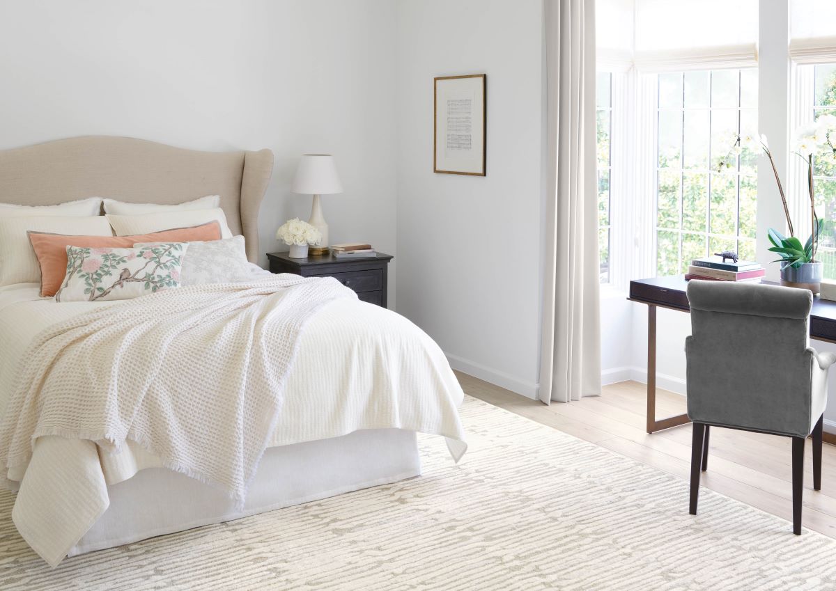
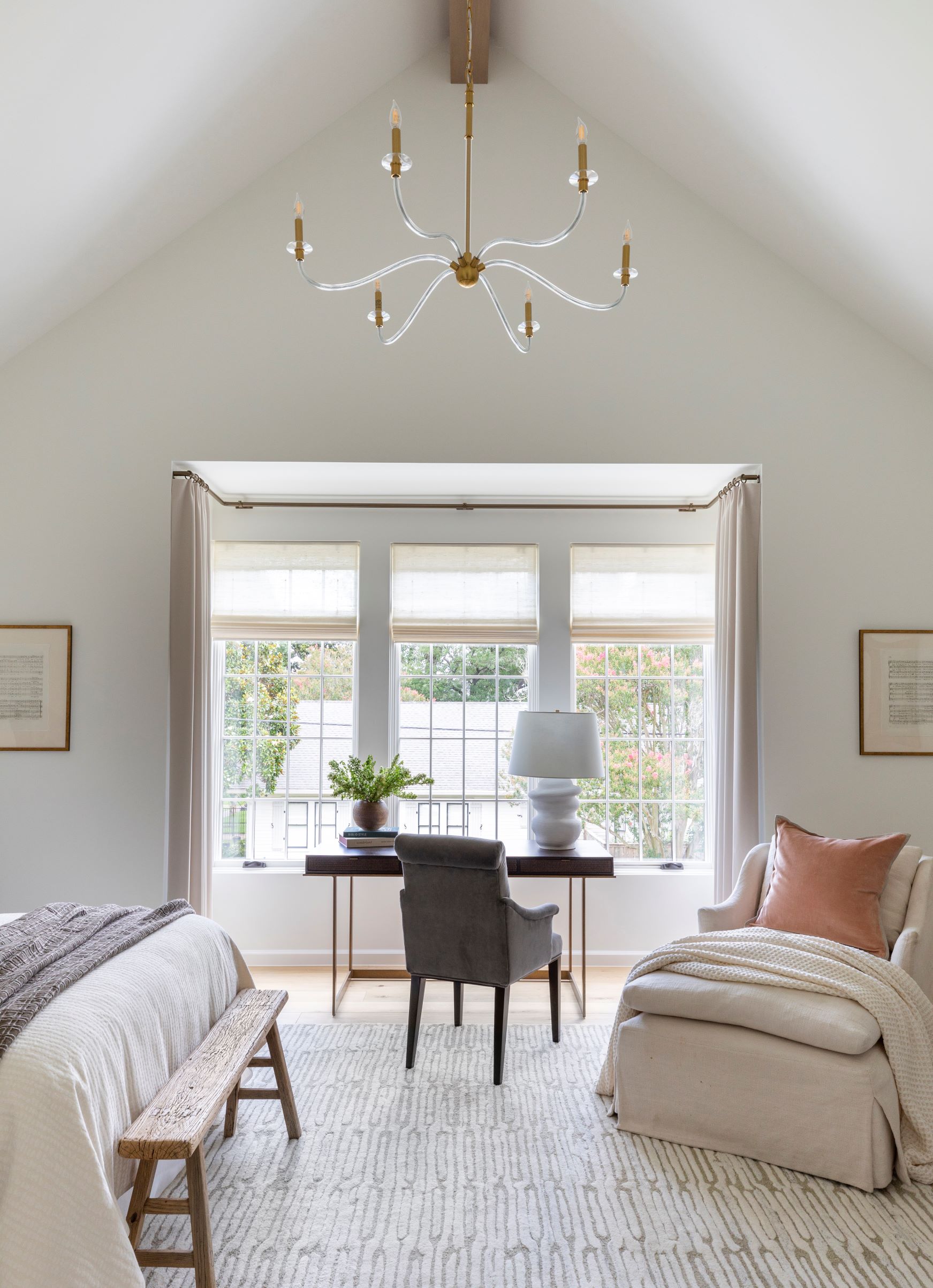
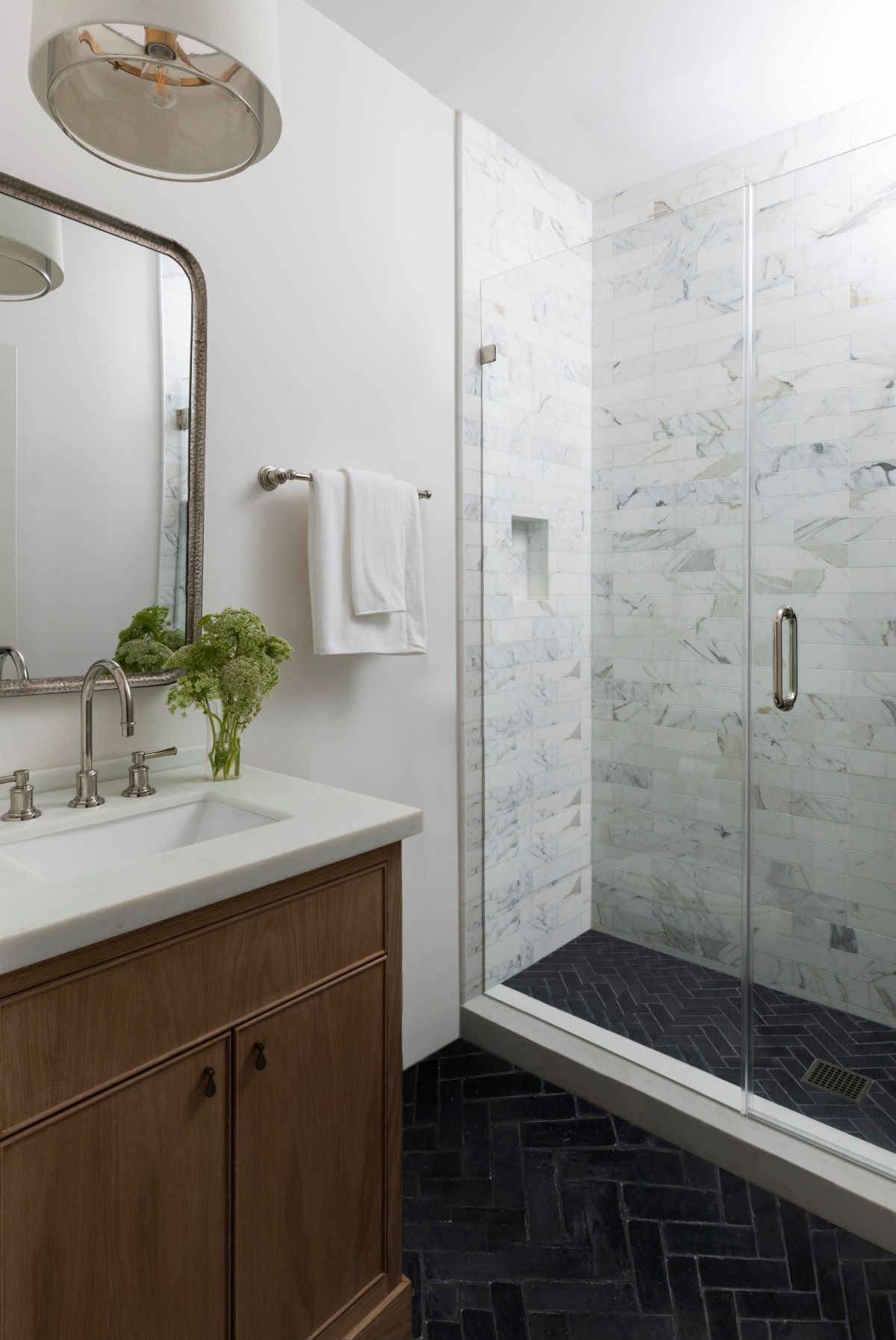
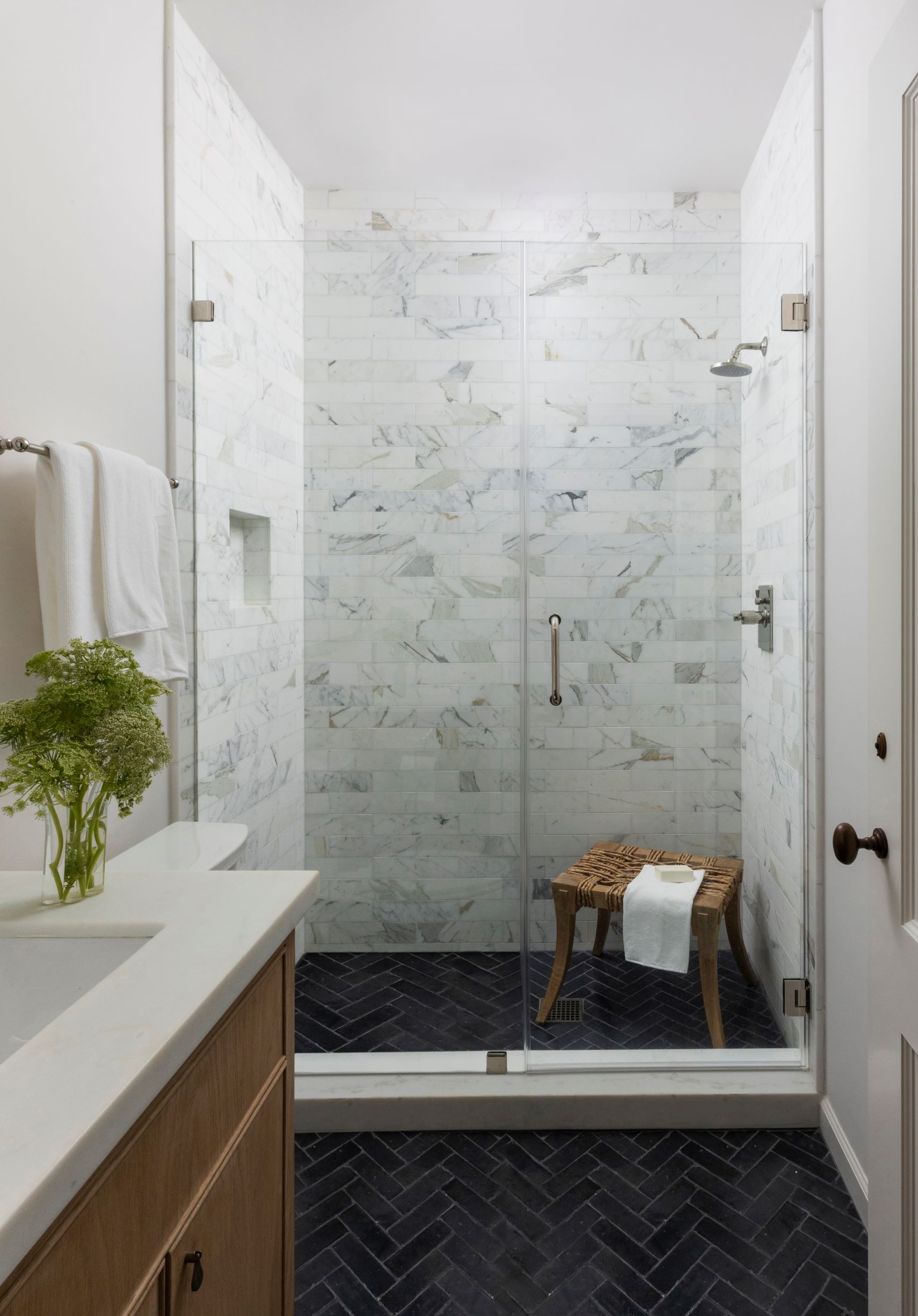
I love having guests over. Whether it’s siblings, parents, in-laws or friends, the door is always open. Thus, it was incredibly important to create a guest suite that allowed visitors to feel comfortable, kick off their shoes and stay. Moving down the hall from the family room, is where the guest room lies. The color palette is very light, as I wanted it to be reminiscent of a boutique hotel. When you walk in, you immediately notice the tall, pitched ceiling with the Lucite chandelier that really makes a statement. Beyond that is a bank of windows and alcove with a writing desk. The large Malone rug is one of the softest rugs in my collection with Annie Selke and I love how it makes the entire room feel connected. From the queen-sized bed to the desk and comfortable chaise, there are plenty of ways to get comfortable. The en suite bathroom has a petite vanity and shower, which are my go-to pieces for a guest bathroom. I kept the palette very clean in this space as well, but love the punch of color from Zia zellige tile in slate grey. The slate great is beautifully complemented by the Bedrosian marble tile found in the shower surround. Because this was a tight space, I used the Sydney pendant from my lighting collection as opposed to sconces or any sort of vanity light.
Design Takeaway: Here’s how I make a bed! First, I start with a high-quality neutral sheet. Choose a weave that suits your personal preference. However, I do suggest investing in a good set to make guests comfortable. Second, I love a matelassé coverlet in a solid color or soft pattern for beautiful layering. Next, add a folded linen duvet at the end of the bed. For pillows, I usually choose decorative shams to match the coverlet and with a beautiful lumbar and/or accent pillow in front. With this minimal method, you’re not taking off a pile of pillows each night. As a bonus layer, drape a throw blanket over the bed!
Design Sources:
- Bed: Custom
- Coverlet and Queen Shams: Marie Flanigan for Annie Selke Shepherd Coverlet in Ivory
- Pillows on Bed and Chaise: Marie Flanigan for Annie Selke Gehry Pillow in Nude
- Euro Shams: Marie Flanigan for Annie Selke Gehry Pillow in Everglade
- Decorative Pillow: Marie Flanigan for Annie Selke Jolie Embroidered Decorative Pillow
- Throw: Marie Flanigan for Annie Selke Caldwell Throw in Grey
- Chandelier:Visual Comfort Hanover Large Chandelier in Burnished Brass
- Desk: Berhardt
- Desk Chair: Duralee
- Table Lamp: Marie Flanigan for Visual Comfort Bingley Lamp
- Chaise: Lee Industries
- Rug: Marie Flanigan for Annie Selke Malone Rug in Oatmeal
- Side Table: Restoration Hardware
- Vanity: Custom
- Faucet: California Faucets Miramar Widespread Lavatory Faucet
- Mirror: Pottery Barn Capital Rounded Rectangular Vanity Mirror in Silver
- Light Fixture: Marie Flanigan for Visual Comfort Sydney Small Pendant in Polished Nickel
- Floor Tile: Zia Tile 2×6 Zellige in Slate Grey
- Shower Surround Tile: Bedrosians Calacatta 3″ x 12″ Honed Marble Tile in White
UTILITY ROOM
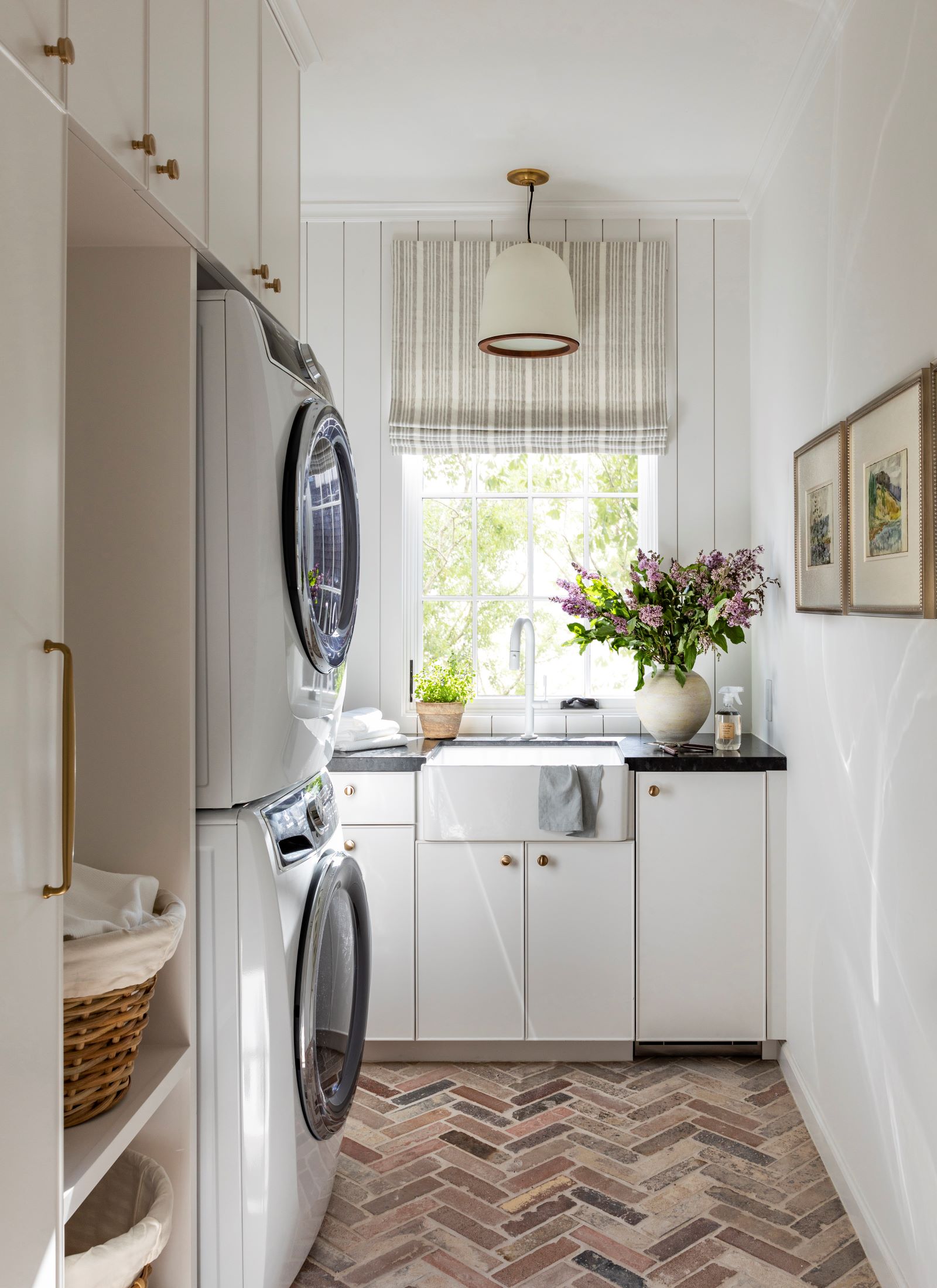
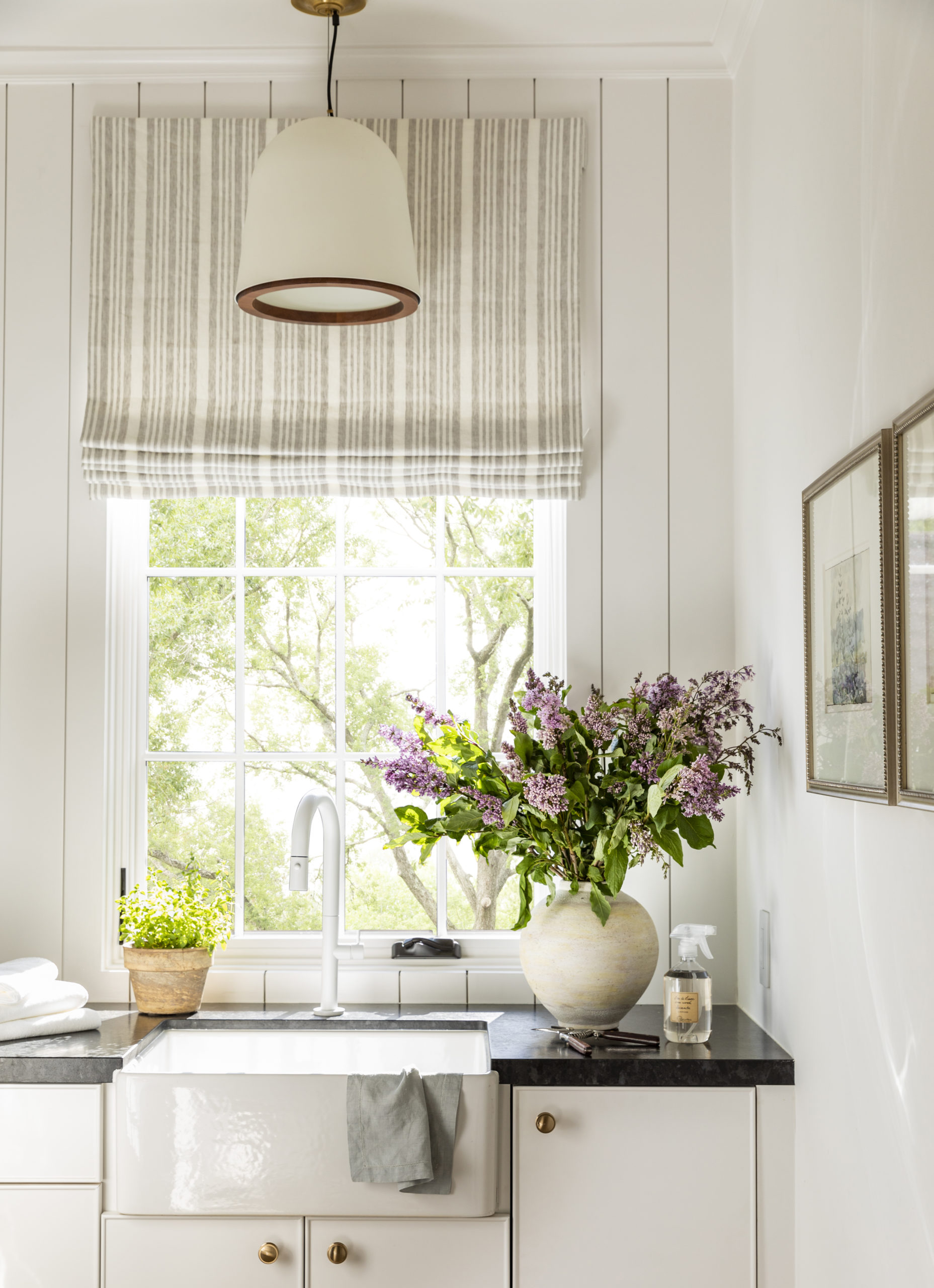
With all of our bedrooms located on the second floor, it only made sense to include the laundry room upstairs as well. Just past the family room, in the image that shows the wooden double doors, there’s a laundry room to the right. This room is a petite space that I maximized for efficiency! The stackable washer and dryer really saved space to allow for ample built-in cabinetry. I love the color on the walls and cabinetry. It’s Sherwin Williams Snowbound and a slight departure from the Greek Villa in the family room. The brick floors are a nod to the exterior of the home, as it’s the same reclaimed brick, but repurposed as pavers. The countertop is a gorgeous stained walnut that offers a natural touch to the space, but see my design takeaway below. If you have a keen eye for detail, you’ll notice the slightest bit of shiplap on the far wall, reminiscent of the ceiling in the family room. Details like these are what make design transitions between rooms seamless. Since I tend to spend a lot of time doing laundry, I wanted to make sure this room was light, happy and functional. For added function, I chose to include a prep faucet and sink in the space. Because inquiring minds always want to know what’s behind the cabinetry, I keep a second set of cleaning supplies, tools, etc. in this space so that I don’t have to lug these items up and down the stairs.
Design Takeaway: I’m thinking about changing the stained walnut countertops to charcoal granite for durability purposes! I absolutely love wood countertops, but am finding that with the rate my family goes through clothing and day-to-day use, a granite might be a better option for this specific room and that is okay! Sometimes you have to live in things to really know how it will work for your household.
Design Sources:
- Roman Shade Fabric: Mark Alexander Bourne Grey Mist
- Faucet: California Faucets Poetto Pull-Down Prep Faucet in Matte White
- Pendant Light: Marie Flanigan for Visual Comfort Murphy Pendant in Plaster White and Dark Teak
- Brick Pavers: South Texas Brick Company Antique Brick
The next stop on our tour will be my kids’ rooms and bathrooms. Children’s spaces are some of my favorite to design and these rooms were no exception. See you back at #MyHouse soon!

[…] Hello again! Welcome to the last of our interior tour of #MyHouse. Hint, the next tour will be all about the exterior details. Today, I’m showing you my primary bedroom, bathroom, dressing room, closet and my husband’s upstairs office. These rooms are located on the second floor, along with the other bedrooms we previously toured here and here. […]
[…] exteriors. If you’re playing catch up, you can find the rest of the home tour in parts 1, 2, 3, 4 and […]