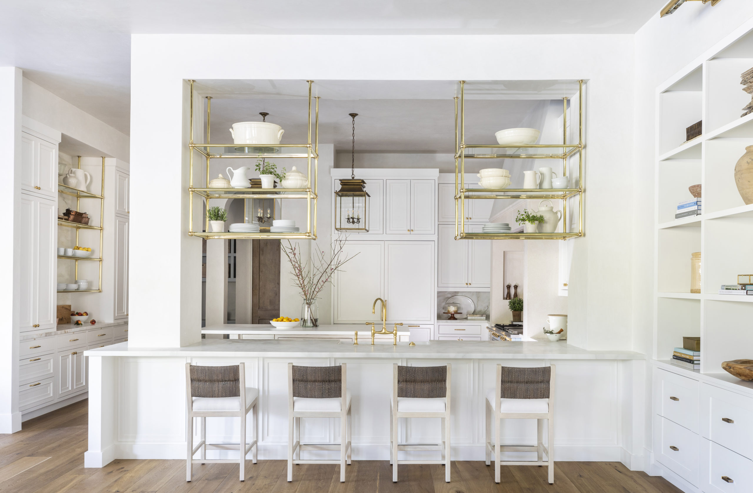
B&A: Royal Point Kitchen, Breakfast, and Living
We’ve got so much to cover at our Royal Point project and today, part two of our tour continues. Tremendous thought and detail went into making the white kitchen, living, and breakfast nook perfect for this six-member family. Our goal was to give them a utility space to cook, eat, play, relax and just be a family. From heavy, 90s-inspired Mediterranean design to light, bright and fresh, you’ll love Royal Point’s continued transformation. If you haven’t already, be sure to check out part one of our tour that includes the entryway, formal living room, and dining room.
White Kitchen
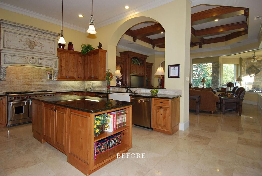
We know that kitchens are the heart of the home and our hearts beat for this space. Meeting the homeowners made clear that having four kids meant including kid-friendly spaces that are functional for entertaining minors. The kitchen and accompanying living areas were full of odd angles and lots of arches. Did we mention that originally building this house took place in the 90s? The homeowners envisioned spending lots of time in this space. They wanted these areas to feel connected, which required reworking the looming partition seen in the before photo.
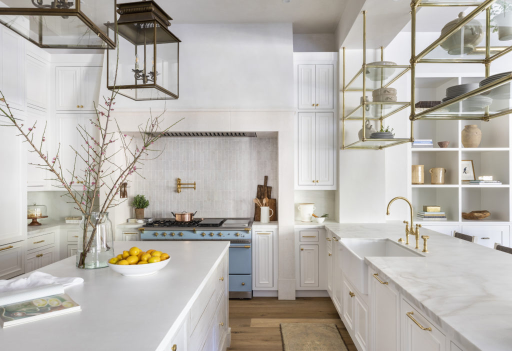
To achieve a better flow, the design team ideated a hanging shelf system consisting of unlacquered brass connections and glass shelves. This allowed for both continuity and counter-space saving display options. The existing island and cabinetry were all removed and replaced with an oversized island complete with Omni Surfaces Calacatta Sponda countertops and inset custom cabinetry in Benjamin Moore White Dove. We also love how the Lacanche range creates a true focal point complemented by a zellige tile backsplash.
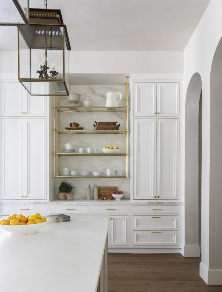
Shop: Counter Stool | Lantern | Dinnerware | Copper | Range Backsplash | Range Hood
Living Room
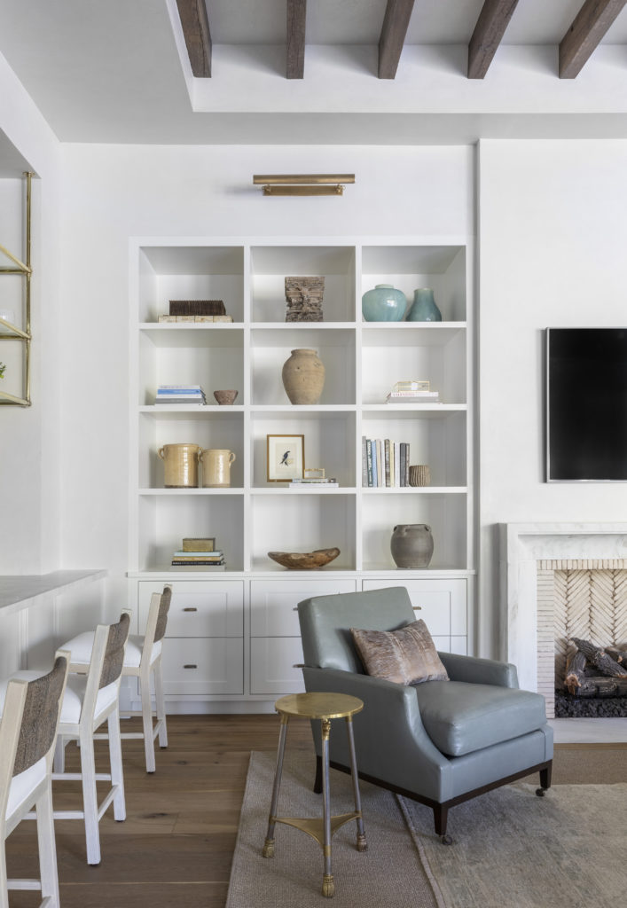
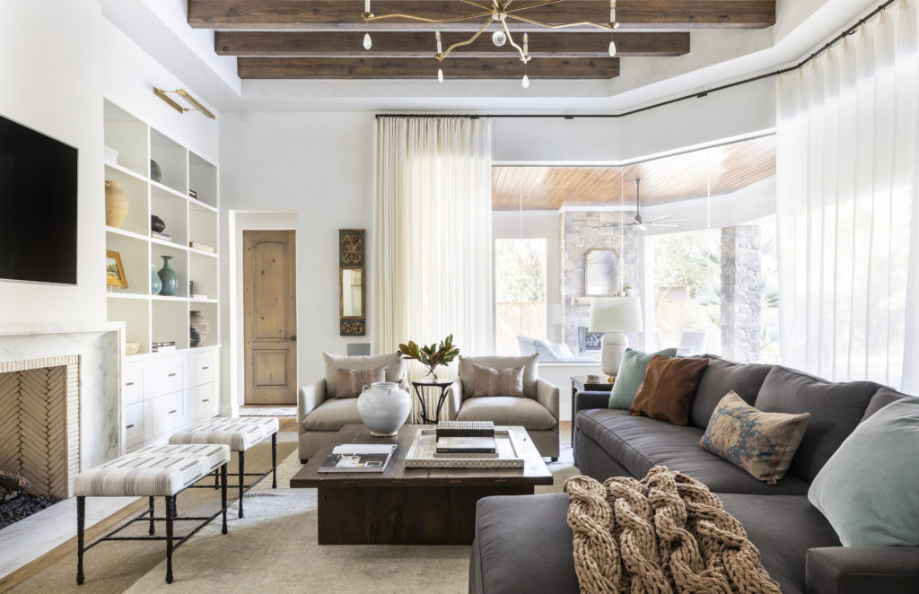
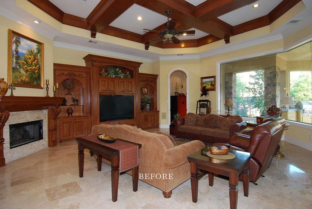
While mom and dad command the kitchen, the living room is for the kids to relax after a long day of sports and school. To better accommodate for display and storage needs, the fireplace was moved and centered, then flanked by built-in cabinetry full of family heirlooms and photos.
A beautiful herringbone pattern lines the interior of the fireplace. The antique, reclaimed purlins, also found in the dining room, create design continuity in this space. A custom, oversized sectional offers ample seating alongside the reclaimed oak coffee table. An expansive Low Country Originals chandelier offers beautiful intrigue to the space, while the breezy drapery controls the natural light. For added warmth and softness under foot, a vintage Turkish rug anchors the space.
Breakfast Nook
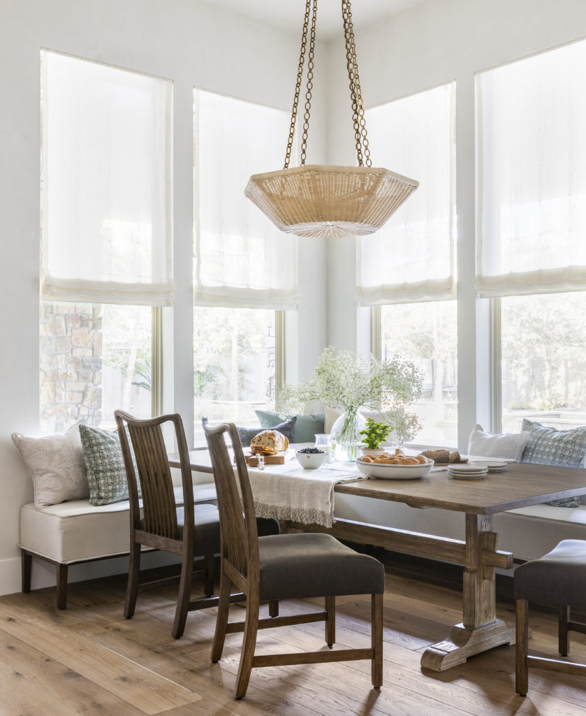
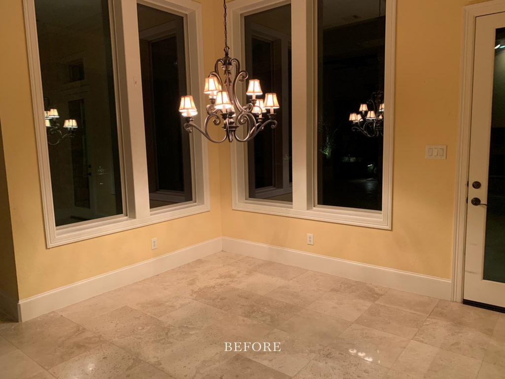
While the bar in this white kitchen offers the perfect amount of seating for busy days, the breakfast nook provides a gathering place for the entire family to share a meal. For added function, the design team incorporated bench seating that can be moved. The custom dining table and chairs are both by The Joseph Company. Then, Soane Britain’s Rattan Asscher Hanging Light adds a touch of organic texture overhead.
[…] to notice light and bright color palette seen throughout Part 1 and Part 2 are carried out through these spaces as […]
[…] For additional Royal Point context and jaw-dropping transformations, be sure to visit Part 1, Part 2 and Part 3 and keep scrolling for a few more special […]
[…] to notice light and bright color palette seen throughout Part 1 and Part 2 are carried out through these spaces as […]
Beautiful! What paint color was used in the kitchen with the White Dove cabinets?