#MyHouse Room Reveal, Part 1
Kitchen, Bar, Dining, Library and Living
Welcome! Come on in. I’m so thrilled to share more details about my home with each of you. I’m beyond appreciative of your interest and comments on social since the reveal, so I thought the blog would be a great place to expound on the process, plans, details and of course, products found throughout. Today, I’ll take you through the kitchen, living room, dining room, bar and library! We’ve got a lot of ground to cover, so let’s get started!
KITCHEN
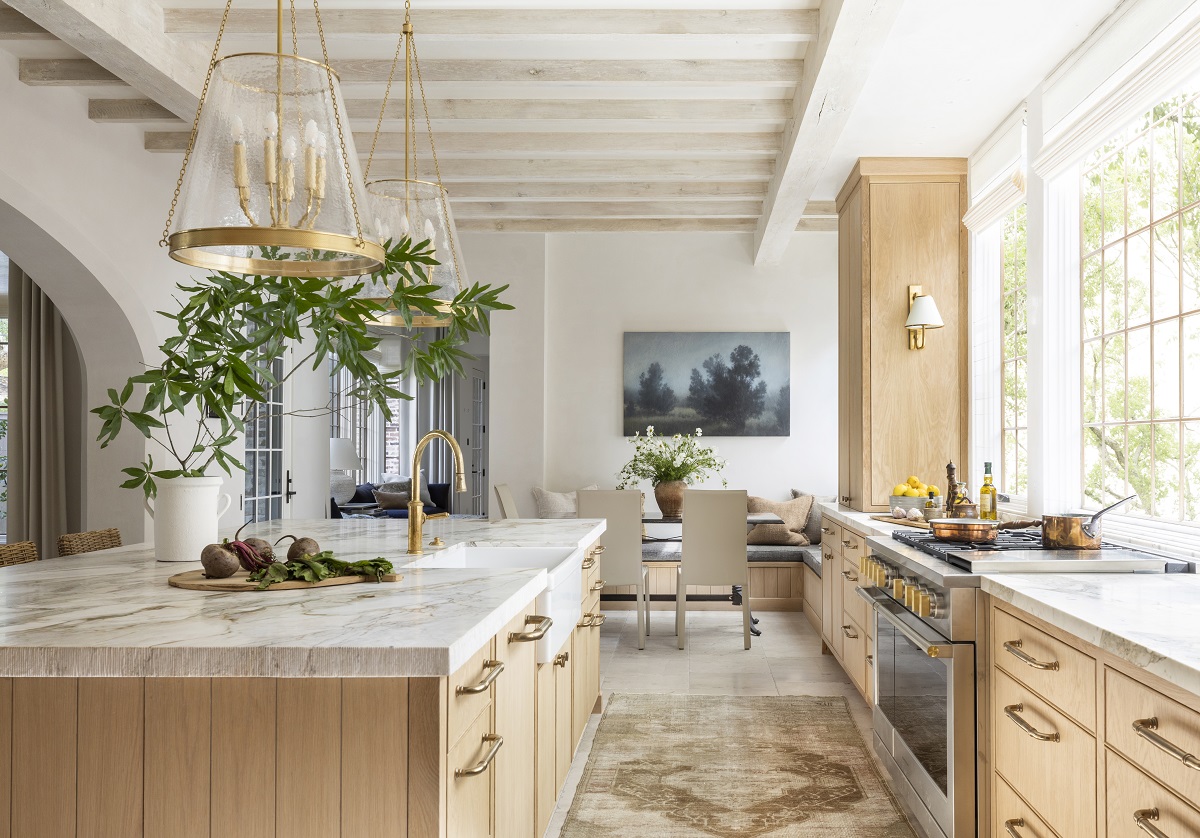
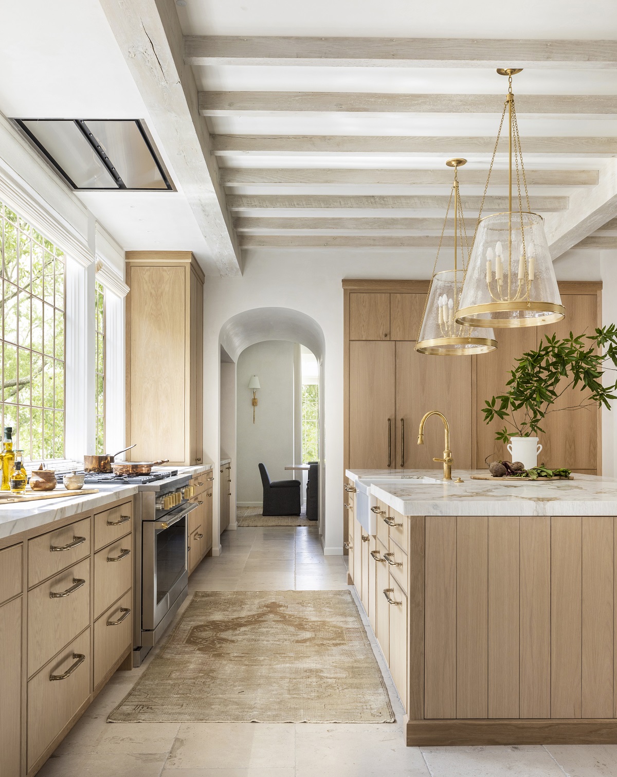
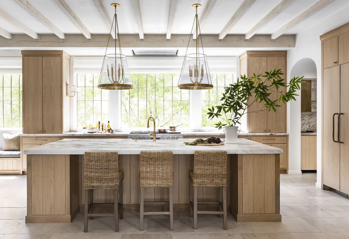
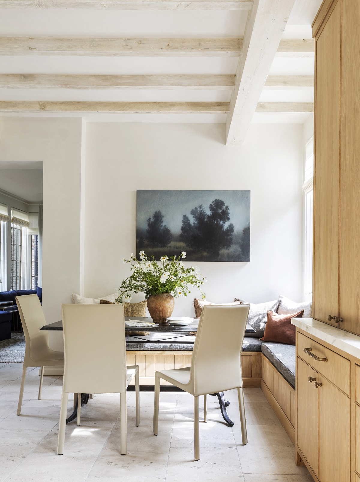
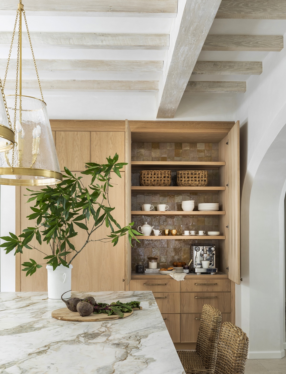
I’m going to start in the kitchen because it’s the nucleus of the home. This room is truly the planet around which my family revolves. From slightly chaotic breakfasts before school to afternoon homework, family dinner fun and quiet cups of tea at night, so much care went into making this space perfect for our needs. First, I knew I wanted the kitchen to open up to the living area as well as include a breakfast nook for daily meals. I also wanted an influx of natural light and the windows play a huge role in the look and feel of this space. Harnessing and showcasing natural light is always incredibly important in any of my designs and my home was no exception. I chose Sherwin Williams Greek Villa paint color for my entire downstairs and loved the warm white that it exudes. I knew that Greek Villa was the perfect canvas for layering tones and textures. All of my windows are covered in Hartmann & Forbes woven wood shades. I absolutely love how the shades add texture and softness to each room. Plus, there’s no shortage of windows in my home, so for added convenience the shades run on an automated Lutron system installed by Bravas.
I love using design elements that reflect nature and you’ll notice those elements in the limestone floors, stained white oak cabinetry and natural stone countertops throughout. The island dimensions were chosen so that I could use one full slab of the Michaelangelo Arebescado Dolomite which eliminates the need for any seams in the stone. Further, unlacquered brass finishes were chosen for the faucet which add warmth and beautiful patina. Perhaps one of my favorite touches is the Rocky Mountain Hardware pulls and knobs. Each piece of RMH hardware is custom-cast in bronze creating slight imperfections that make each piece unique. The breakfast nook and bench give us a casual spot to enjoy meals, homework, games and simply to do life. I made sure that the bench included outlets to plug in computers and devices. Speaking of outlets, I had to do a few of my viral outlet hacks in my own house. On the island, I included flush Bocci outlets to keep the design streamlined and sleek. The lighting throughout the kitchen is from my collection with Visual Comfort and I think the oversized nature of the Reese pendants over the island provide lovely scale and symmetry to the space.
Design Takeaway: Before your build or renovate, pay attention to how you and your family function in the kitchen. From small things like how you prepare your coffee or tea to where you tend to chop veggies and proximity to a trash can. All of the little details will inform how you should layout your space.
Design Sources:
- Floors: Material Bespoke Paloma Limestone: French Quarter Finish
- Windows: Sierra Pacific
- Shades: Custom Woven-To-Size Grassweave
- Countertops: Michaelangelo Arebescado Dolomite
- Lighting Over Island: Reese 22” Pendant in Soft Brass with Restoration Glass
BAR
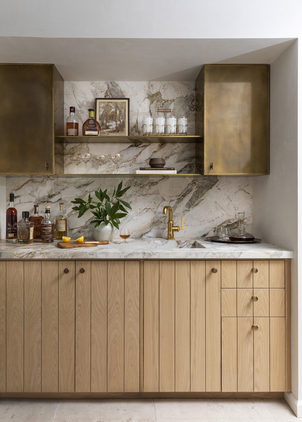
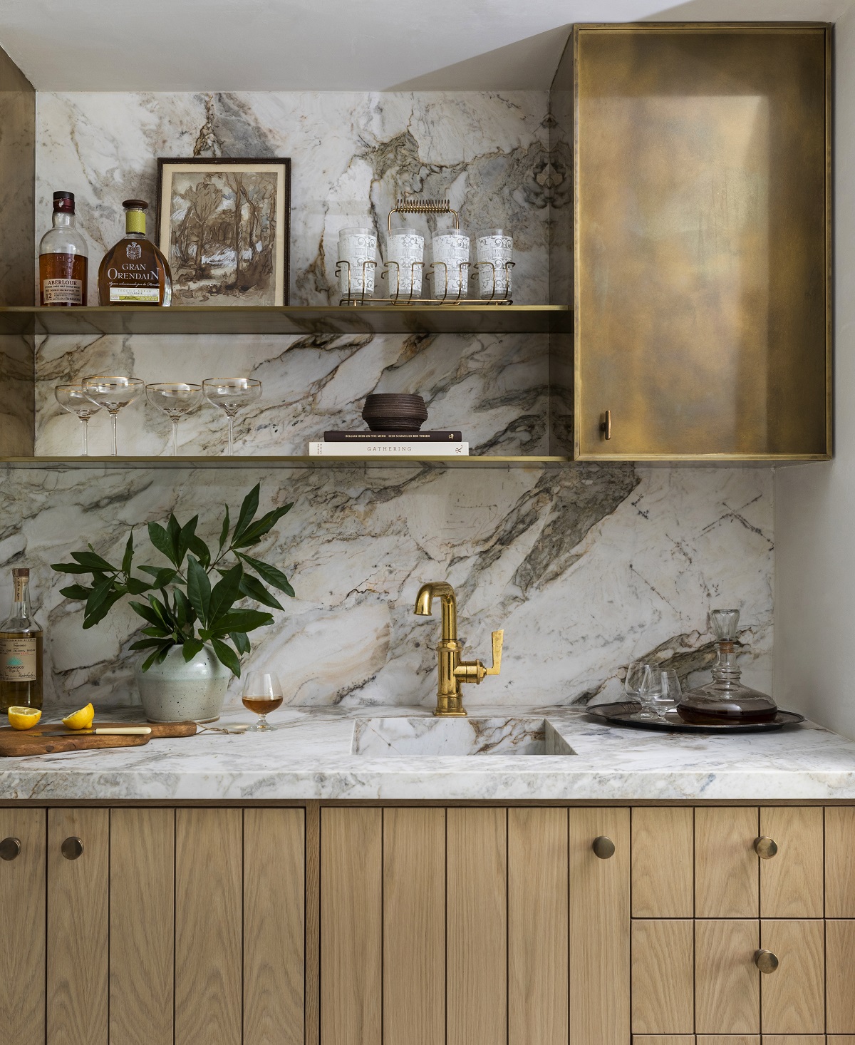
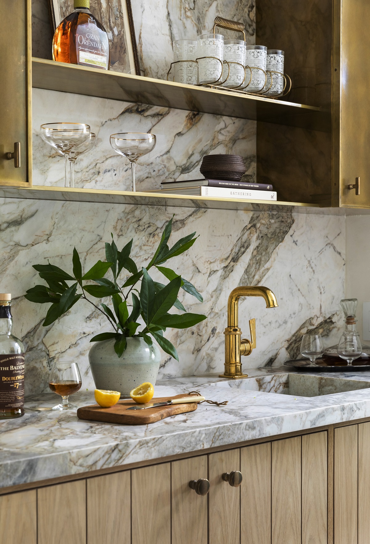
From the kitchen, we head into the bar. I love this area because it is a tiny jewel box space that adds interest and function as you pass from the kitchen to the dining room. I carried over the same stained white oak cabinetry and countertops found in the kitchen, but added the gorgeous unlacquered brass upper cabinetry and shelving as a fun detail to store and showcase barware. One of the lower cabinets is an ice maker that is carefully concealed. You can also see from the kitchen photo above that the ceiling is curved which creates an intimate space compared to the higher ceilings in the adjacent room. Many spicy ranch waters have been crafted and subsequently consumed since moving in! Cheers to that.
Design Takeaway: Make sure you include any appliances that will add ease and function to the space. Whether that’s an ice maker, wine fridge or beverage drawer, you won’t regret the added convenience.
Design Sources:
- Floors: Materials Bespoke Paloma Limestone: French Quarter Finish
- Countertops and Backsplash: Michaelangelo Arebescado Dolomite
- Hardware on Lower Cabinets: Rocky Mountain Hardware Carriage Cabinet Knob
- Hardware on Upper Cabinets: Rocky Mountain Hardware Olympus Cabinet Knob
DINING ROOM
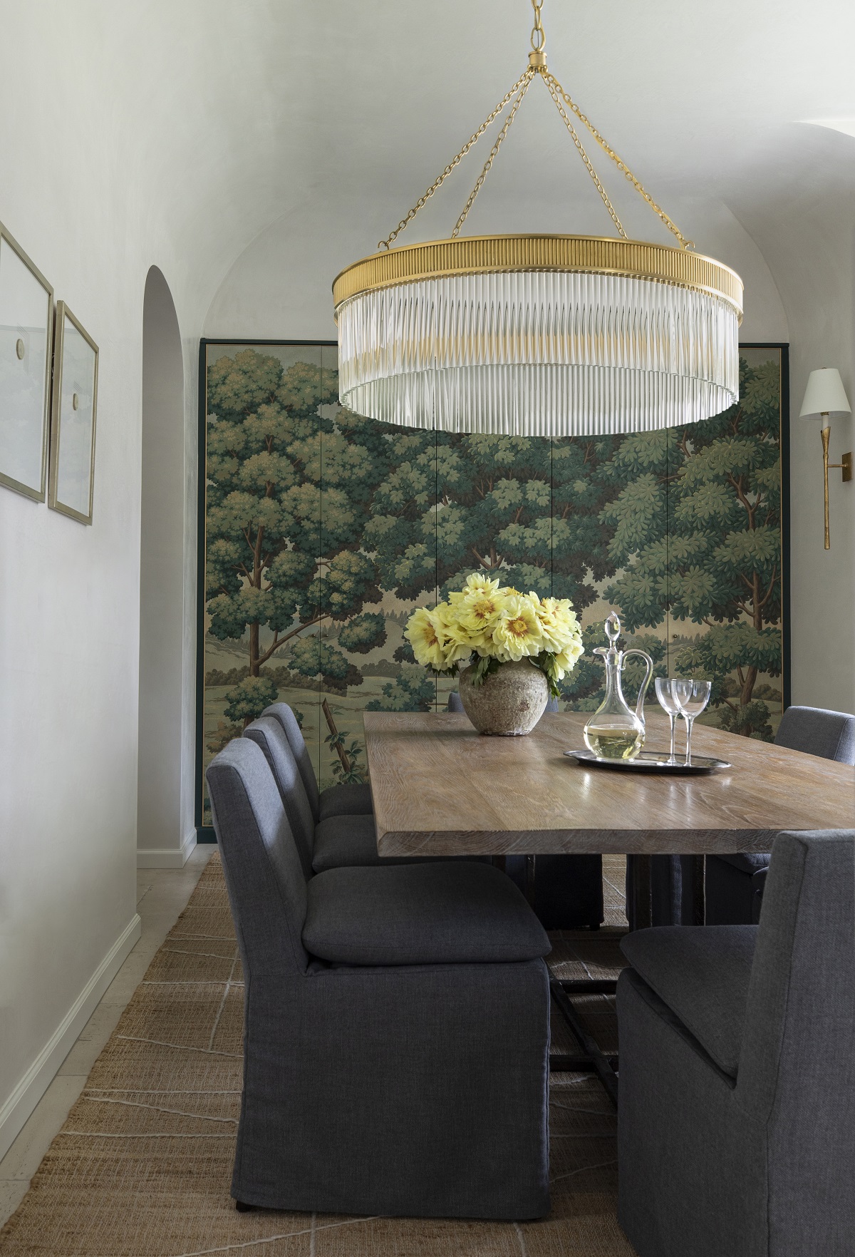
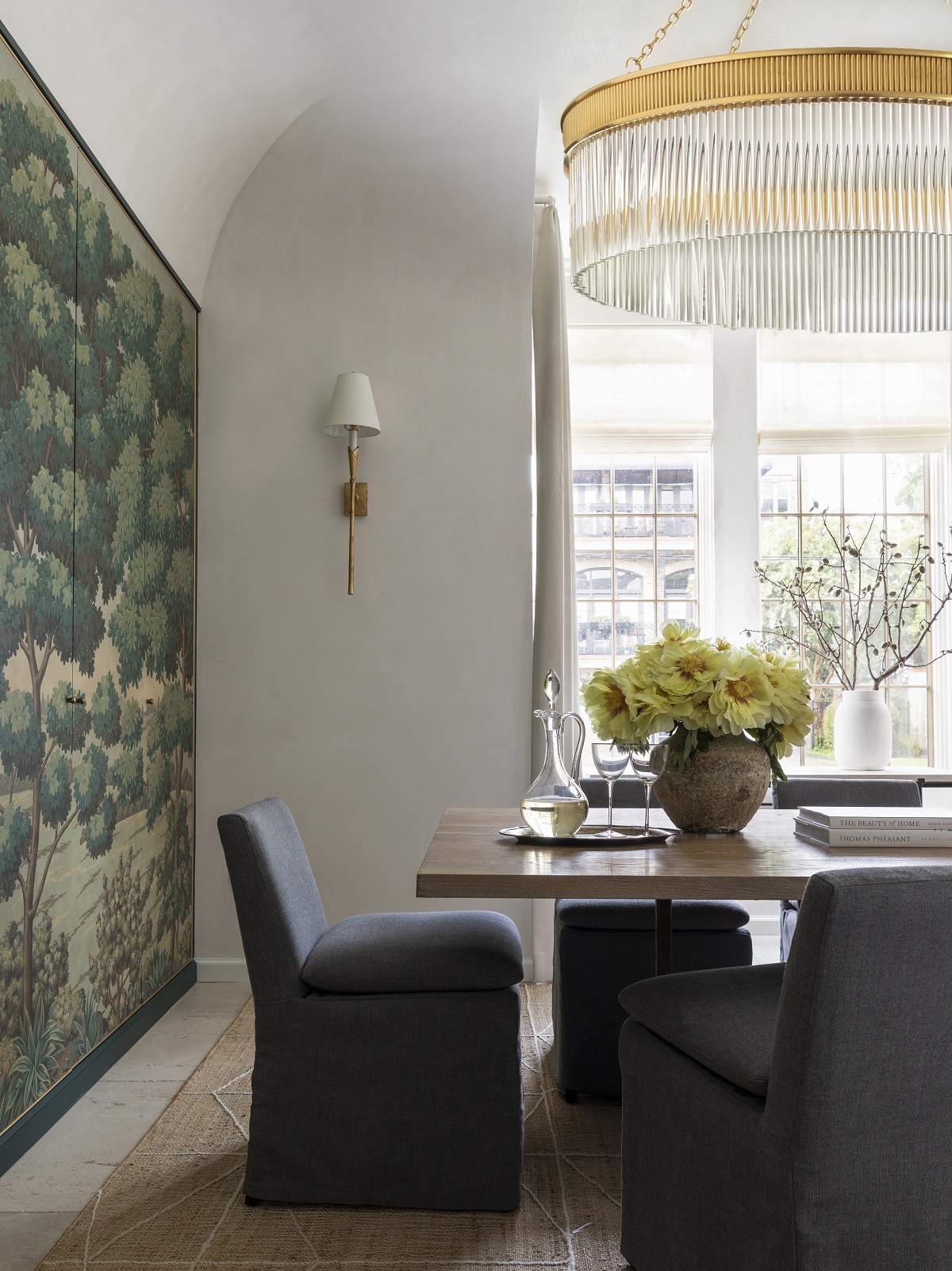
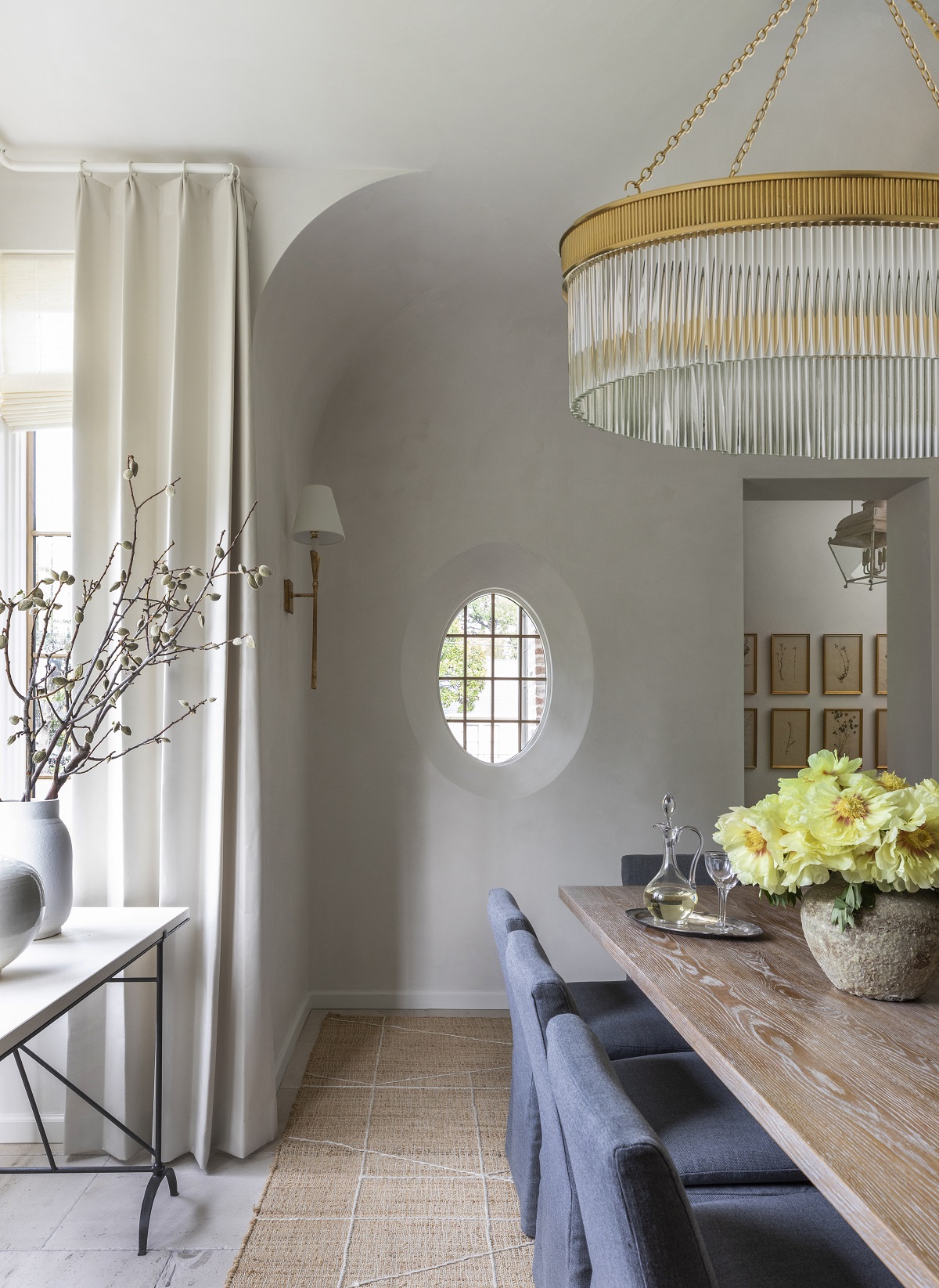
I have three kids and I’m one of five kids (with lots of nieces and nephews), so family get-togethers are large celebrations! As such, I wanted to make sure I had a dining room that created a special atmosphere for entertaining. It was important to fit a sizable table that could comfortably accommodate larger parties. I also wanted additional and convenient storage. Creating the built-in alcove behind the beautiful custom Gracie wallcovering makes for a statement art piece while adding function. Fun fact, the wall covering design was inspired by antique tapestries. There are five panels that open up and reveal shelving for entertaining pieces. More on that design detail here. The room remained light and bright with the same Sherwin Williams Greek Villa paint color complemented by the Mark Alexander drapery in a gorgeous plaster color. You’ll also notice the slight curve detail in the ceiling. I loved this architectural touch to help distinguish the space from the rest of the house.
Design Takeaway: Storage matters! Don’t let walls go to waste. When possible, think through how you can maximize storage in your home with simple built-in shelving. This built-in isn’t incredibly deep, but still holds a lot of my glassware and entertaining pieces.
Design Sources:
- Floors: Materials Bespoke Paloma Limestone: French Quarter Finish
- Windows: Sierra Pacific
- Shades: Hartmann & Forbes
- Wall Covering: Custom Gracie Studio
- Drapery: Mark Alexander Lexington in Plaster
LIBRARY
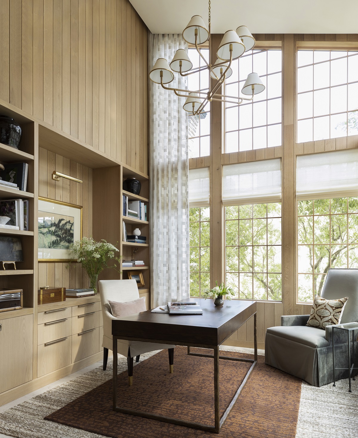
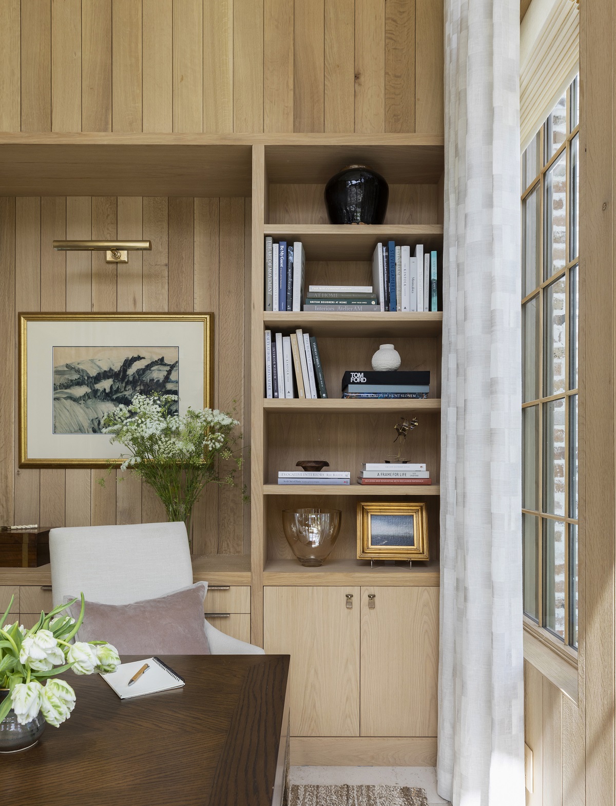
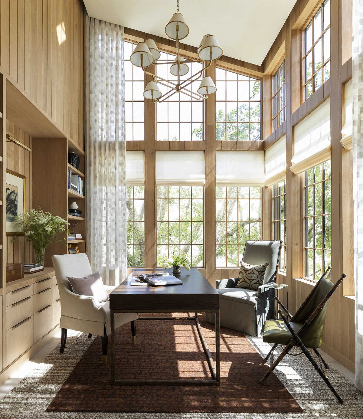
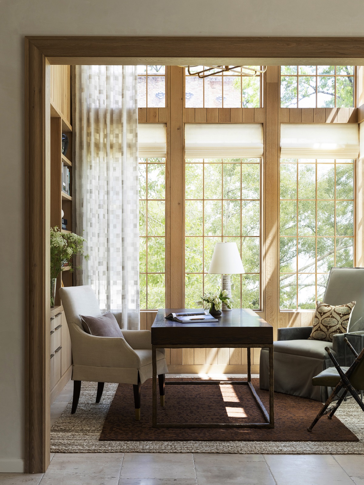
Let there be light…lots of light! This room was such a dream to design. My goal was to create a space that allowed you to pause and appreciate the details. From the stained white oak paneling throughout to the floating ceiling, I took some fun architectural and design liberties to elevate the space. Further, to ensure a bit of privacy, the Hartmann & Forbes woven woods can be raised and lowered electronically. With so many windows, this automated function has been such an appreciated luxury. As the eye travels up, you’ll notice the Mark Alexander drapes are neatly tucked into the floating ceiling. I love the clean and streamlined finish this detail creates. I’m also a big proponent of layering rugs to achieve a sense of space and love how the Lewis rug and Mina rug from my collection with Annie Selke anchor such a high ceiling.
Design Takeaway: In each home I design, I like to create a room that is unexpected and slightly different in design from the rest of the house. I call this type of room a “jewel box” and the library is ours. From the room’s two-story ceiling height to the paneling, it’s a departure from the rest of the home’s plaster and lower ceiling height.
Design Sources:
- Windows: Sierra Pacific
- Chandelier: Marie Flanigan for Visual Comfort, Rigby Grande Two Tier Chandelier in Soft Brass and Natural Oak
- Desk Chair: Lexington, Carlyle Upholstered Arm Chair
- Desk: Custom
- Accent Chair Upholstered: Area Houston
- Accent Chair Pillow: Area Houston
- Accent Chair Leather: Antique
- Millwork and Trim: Stained White Oak
LIVING ROOM
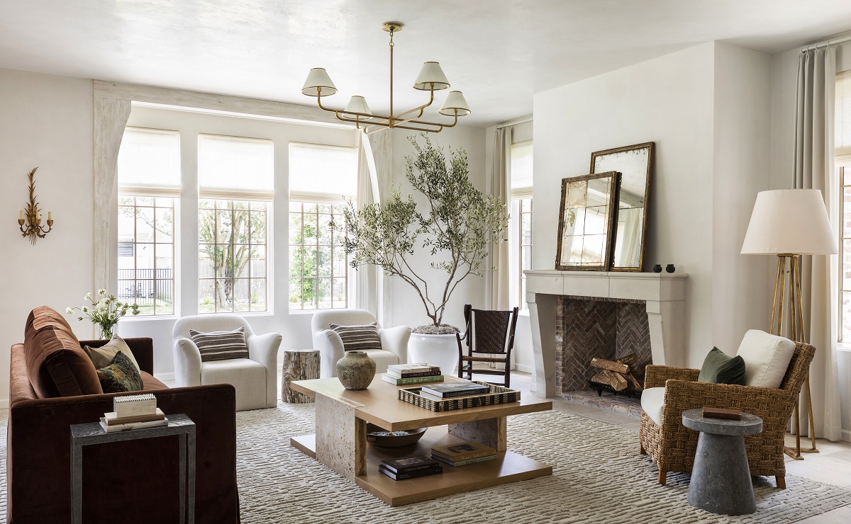
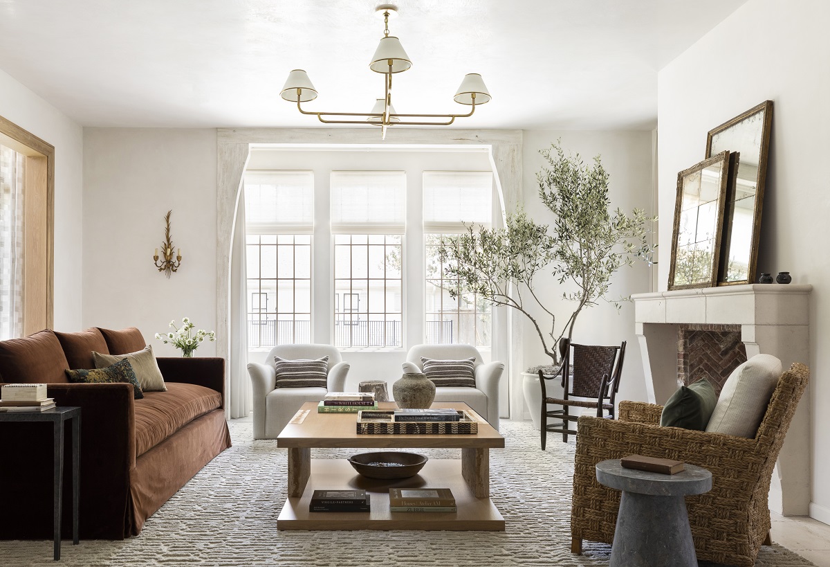
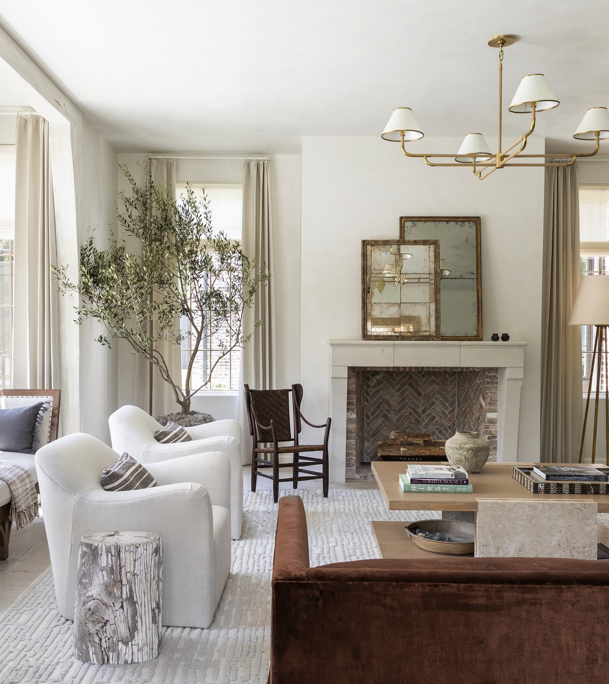
One of my go-to bits of design advice is to mix and match pieces within your home. Don’t subscribe to one specific design trend or aesthetic. Instead use antiques with newer pieces, different finishes and patinas as they’ll work together to give your space a collected-over-time feeling that will also stand the test of time. My living room is a great example of how I often mix these pieces and I’m so pleased with how it turned out. I love the layers and natural elements that keep the room light, anchored and intimate. With three kids, I also needed this space to be comfortable and family friendly. Since this room is connected to the library, you’ll see the same woven woods, but the window treatments were changed to a luxe lambswool satin in a soft neutral from Mark Alexander. The room’s texture is what makes it so welcoming and that’s accomplished through the mix of layers and textiles. I started with the Gates rug from my collection with Annie Selke, which is a gorgeous undulated wool rug. Then, juxtaposed its lightness with a custom Lam Bespoke sofa in the gorgeous bronze fabric. I couldn’t resist the fluid lines of the Gregorious Pineo Hadley chairs and love their softness next to the antique accent chair and seagrass chair. The mirrors on the mantle are also antique and were sourced in Round Top. Before you ask, no, those mirrors weren’t just for staging photographs. We actually don’t have a television downstairs! The coffee table is also a custom piece that I created. I wanted to mix finishes that were slightly brutalist in design and unexpected, making the travertine and wood a perfect pairing. The stone and metal side tables introduce additional elements to the space, also adding depth to the color palette.
Design Takeaway: Design around what you have! A lot of the pieces in this room were pieces I already had from my last home or never made it into a clients’ homes. You can truly mix and match pieces and still create beautiful harmony. Get creative with fabrics and finishes that complement but don’t clash!
Design Sources:
- Floors: Material Bespoke Paloma Limestone: French Quarter Finish
- Windows: Sierra Pacific
- Countertops: Michaelangelo Arebescado Dolomite
- Lighting Over Island: Reese 22” Pendant in Soft Brass with Restoration Glass
Whew! That’s it for today’s tour. In a few weeks, I’ll be sharing more about my downstairs support spaces like the sunroom, powder room, butler’s pantry and mudroom. Stay tuned!
[…] serve as a lot of the support and overflow spaces for the home. If you missed Part 1, check it out here. Now, let’s […]
[…] and the utility room. If you’re interested in exploring downstairs, you can find all the details here and here! Back to the tour. I’m excited to share some design tips and considerations I made for […]
[…] about exteriors. If you’re playing catch up, you can find the rest of the home tour in parts 1, 2, 3, 4 and […]
which color of the gates rug is this?
plaster!
This is all so beautiful! I was curious if you painted both the walls, and window mullions all in Greek Villa? Is the window trim also Greek villa?
This is absolutely beautiful!! Do you mind sharing the stain type and color you used on your Stained white oak? In the study and also on your floors? I love it!
Stumbling upon this and it’s so beautiful! Would you share where the zellige tile is from behind your coffee bar? I didn’t see it mentioned but the color is stunning!