
#MyHouse Room Reveal, Part 4
EVE’S ROOM AND BATHROOM, BOYS’ ROOM AND BATHROOM
Hi there! I’m happy that you’re back. Today’s tour will be quick but some of these spaces you haven’t seen and I’m excited to show you. I’ll take you through my daughter’s room and bathroom, along with my sons’ room and bathroom. I’ve said it before, but it’s so much fun to design kids’ spaces. To me, it’s always important to create a space that kids can grow into. In my opinion, kids grow entirely too quickly and I love to think through how children and spaces can mature.
EVE’S ROOM
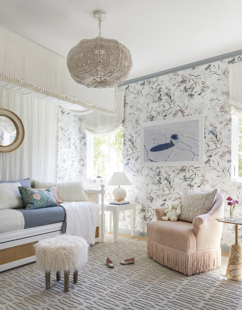
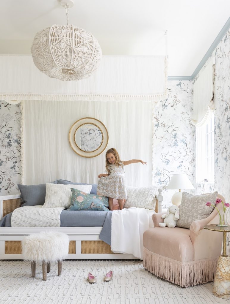
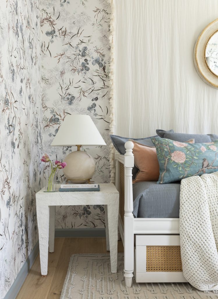
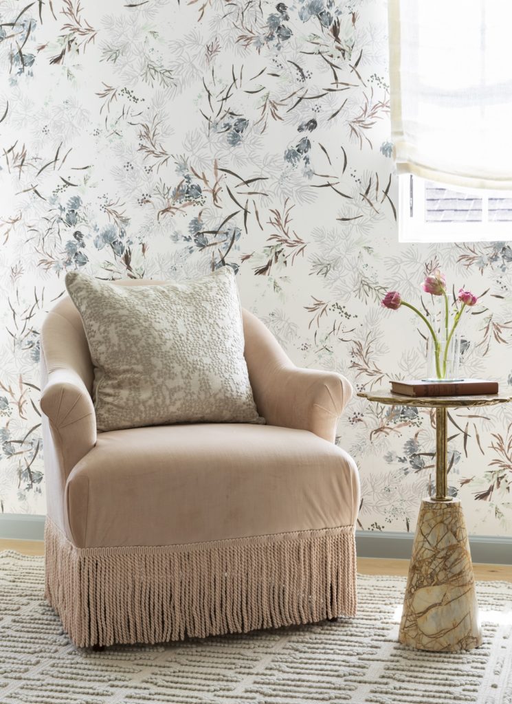
If you’ve been a follower for a while, you may be familiar with Eve’s nursery from our last house. Where does the time go?! You may also notice a few repeat elements that are found in her big girl room! We used the same daybed and light fixture, which both transitioned beautifully between spaces. Now that my daughter is four, it was important to create a space that encapsulated her bubbly, spunky and feminine personality. First, I am a fan of all things Kelly Ventura. So, when looking for the perfect wallcovering, I knew I wanted to use her Meadow wallcovering because it was feminine, fun and whimsical. Then, to complement the wallcovering, I chose Sherwin-Williams Eventide (SW 9643) for the room’s trim. The canopy over her bed is a beautiful soft linen that I also used on the window treatments. I really loved how the canopy framed the bed and created a beautiful focal point. Before I even started designing Eve’s room, I envisioned a pink chair with fringe and this amazing arm chair from Chairish. I knew that it was the perfect piece.
Onto bedding! I love dressing a daybed and Eve’s bed is full of some of my favorite designs and textiles from my line with Annie Selke. So much of what I design is inspired by my family and these pieces are no exception. I love the delicate blue details in the coverlet, accent pillows and sheeting. I’ve got the full list below!
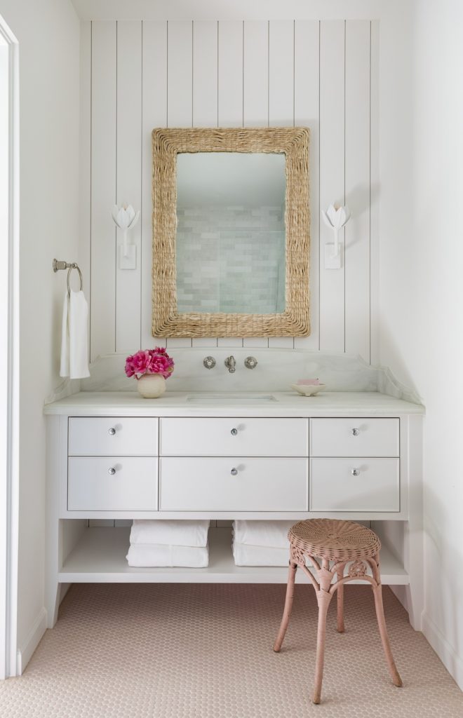
For the bathroom, it’s perfectly girly and I love it. The floor is complete with penny rounds in pink…what else! While Julie Neill’s iconic Alberto sconces flank the seagrass mirror. The faucet is polished nickel for an extra bit of shine.
Design Takeaway: Have fun! When deciding on a kids’ room, keep your base somewhat neutral so that you can add and take away layers as they grow. When deciding to go for the wall covering, I knew that the delicate blues and light tones would be very easy to complement if Eve ever wanted to change out bedding or accent colors.
Design Sources:
- Wallcovering: Kelly Ventura Meadow Wallpaper in Dew
- Light Fixture: Anthropologie, No Longer Available
- Mirror: Antique Mirror from Area Houston
- Bed: Perigold, No Longer Available
- Arm Chair: Chairsh Fringe Chair in Titan Pink Champagne
- Rug: Marie Flanigan for Annie Selke Campbell Rug in Plaster
- Table Lamp: Marie Flanigan for Visual Comfort, Price Lamp
- Side Table Near Chair: Palacek, No Longer Available
- Bedding Quilt: Marie Flanigan for Annie Selke Taft Neutral Quilt
- Bedding Coverlet: Marie Flanigan for Annie Selke Roark in Pewter Blue
- Embroidered Throw Pillow: Marie Flanigan for Annie Selke Jolie in Blue
- Throw Pillow on Chair: Marie Flanigan for Annie Selke Lydia in Plaster
- Artwork: Gray Malin Disco Ball
- Fabric for Canopy and Shade: Mark Alexander Dapple Jasper in White
- Woven Wood Shade: Hartmann & Forbes Papyrusweave Unity in Common Ground
- Trim Color: Sherwin Williams Eventide (SW 9643)
- Windows: Sierra Pacific
- Vanity: Custom
- Faucet: California Faucets, Montecito Wall Mount Faucet in Polished Nickel
- Sconces: Julie Neill for Visual Comfort, Alberto Small Sconce
- Floor: Material Bespoke, Penny Rounds in Pink
BOYS’ ROOM
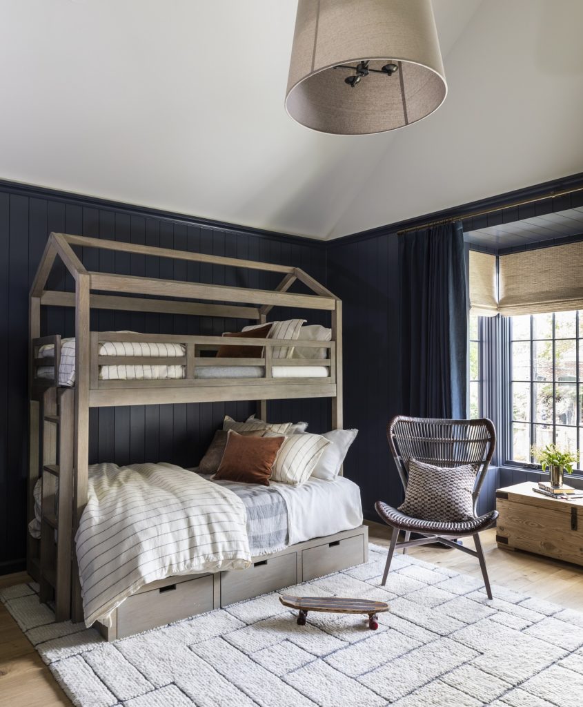
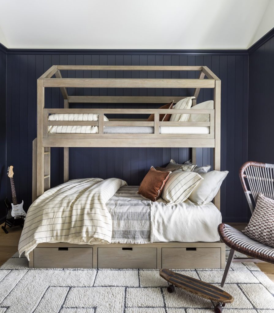
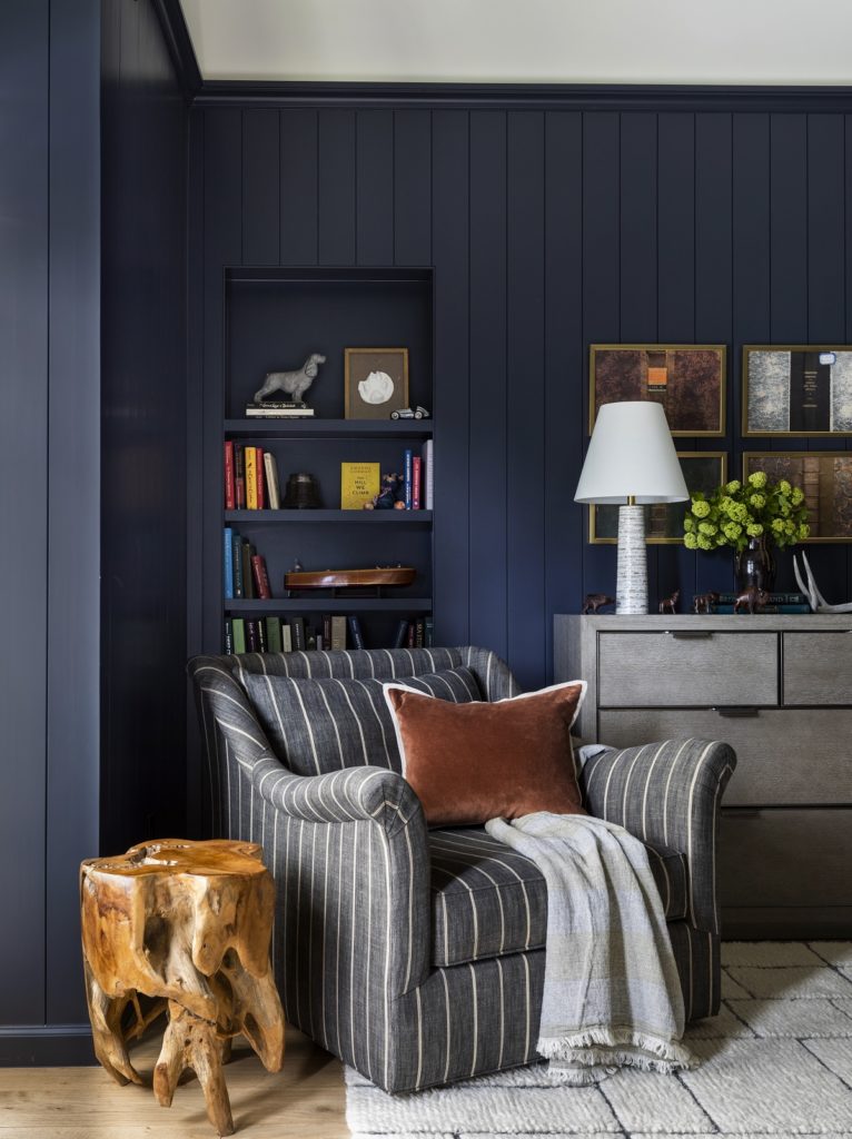
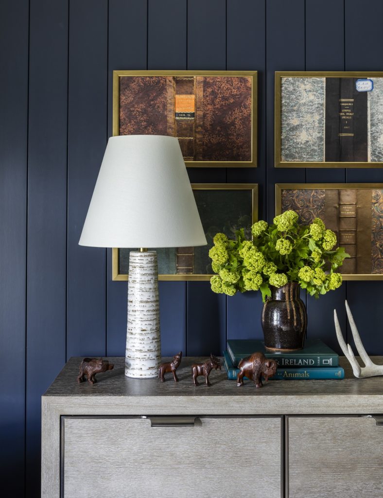
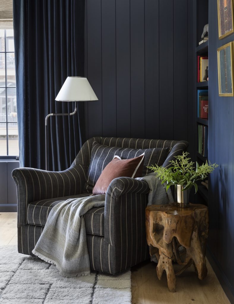
My two boys can be pretty rough and tumble. So, when designing their shared room, I knew I would need two things, lots of floor space and lots of storage space. I loved the idea of a saturated room and chose the Sherwin-William Sea Mariner (SW 9640) as the wall color. The room is also paneled which adds a fun and masculine detail to the space. The ceiling is 15’ high in this room, so adding the oversized drum light created just the right amount of drama. I get questions about their bunk bed and it’s a bunk bed from Restoration Hardware that I customized for the added storage at the bottom. You’ll notice the drapes which are almost the color of the wall and the woven woods from Hartmann & Forbes. In the corner near the upholstered arm chair, I added some inset shelving for display and a pop of color. The boys have an awesome closet that’s outfitted with shelf storage for trucks, Legos, and baskets. They also have a little loft in their room, which isn’t pictured, but definitely elevates the level of fun they can have in their room.
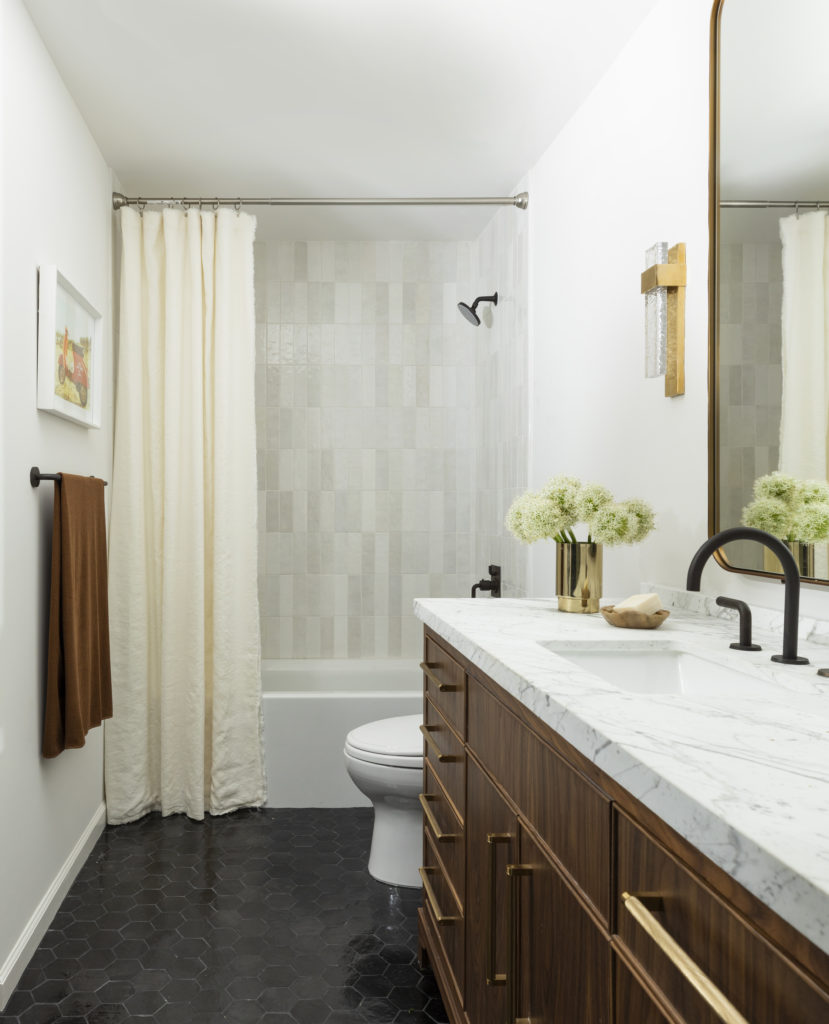
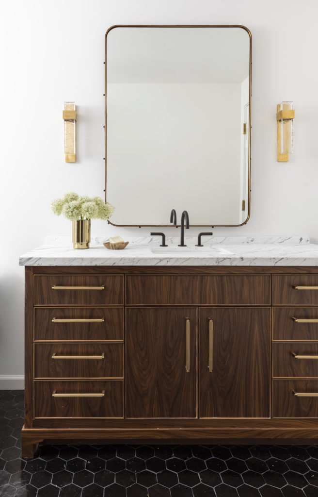
The boys’ bathroom was one of my favorite rooms to design. I love the finishes and how they all work together between the light, dark, stained walnut and brass. The space is an updated twist on traditionally masculine finishes. The tile is a gorgeous hexagon Zellige from Zia Tile in Carbon Black, set off by the ceramic tile surround. The hardware and sconces add the right mix of brass touches for a pop of color. I used the Brock sconce from my collection for a smidge of elegance in a room run by boys!
Design Takeaway: Mix it up! Your bathrooms are a great place to mix light and dark finishes. You’ll notice that this bathroom also doesn’t have natural light, but still reads like a light space, despite the dark flooring!
Design Sources:
- Bed: Custom
- Wall Color: Sherwin-Williams, Sea Mariner (SW 9640)
- Rug: Marie Flanigan for Annie Selke, Cowan Rug
- Duvet: Marie Flanigan for Annie Selke, Leigh Linen Iron Duvet
- Coverlet: Marie Flanigan for Annie Selke, Langham Moss Blanket
- Pillow: Marie Flanigan for Annie Selke, Ghery Pillow in Copper
- Drum Light: Restoration Hardware, No Longer Available
- Floor Lamp: Marie Flanigan for Visual Comfort, Rigby Medium Bridge Arm Floor Lamp in Polished Nickel and Ebony
- Floor Tile: Zia Tile, Zellige Hexagon in Carbon Black
- Surround Tile: Bedrosians, 2.5” x 8” Ceramic Tile in White
- Paint Color: Sherwin-Williams, Snowbound (SW 7004)
- Lighting: Marie Flanigan for Visual Comfort, Brock Medium Sconce in Soft Brass
- Mirror: Mirror Home, Brompton and Bronze
- Faucet: California Faucets, Tamalpais Widespread Lavatory Faucet in Oil-Rubbed Bronze
- Towel: Marie Flanigan for Annie Selke, Blythe Towel in Copper
- Windows: Sierra Pacific
We’ve got two more blog reveals left, so come back next week for the primary bedroom, closet, bathroom and upstairs office!
[…] These rooms are located on the second floor, along with the other bedrooms we previously toured here and […]
[…] If you’re playing catch up, you can find the rest of the home tour in parts 1, 2, 3, 4 and […]
[…] If you’re playing catch up, you can find the rest of the home tour in parts 1, 2, 3, 4 and […]