#MyHouse Room Reveal, Part 5
PRIMARY SUITE & UPSTAIRS OFFICE
Hello again! Welcome to the last of our interior tour of #MyHouse. Hint, the next tour will be all about the exterior details. Today, I’m showing you my primary bedroom, bathroom, dressing room, closet and my husband’s upstairs office. These rooms are located on the second floor, along with the other bedrooms we previously toured here and here.
PRIMARY BEDROOM
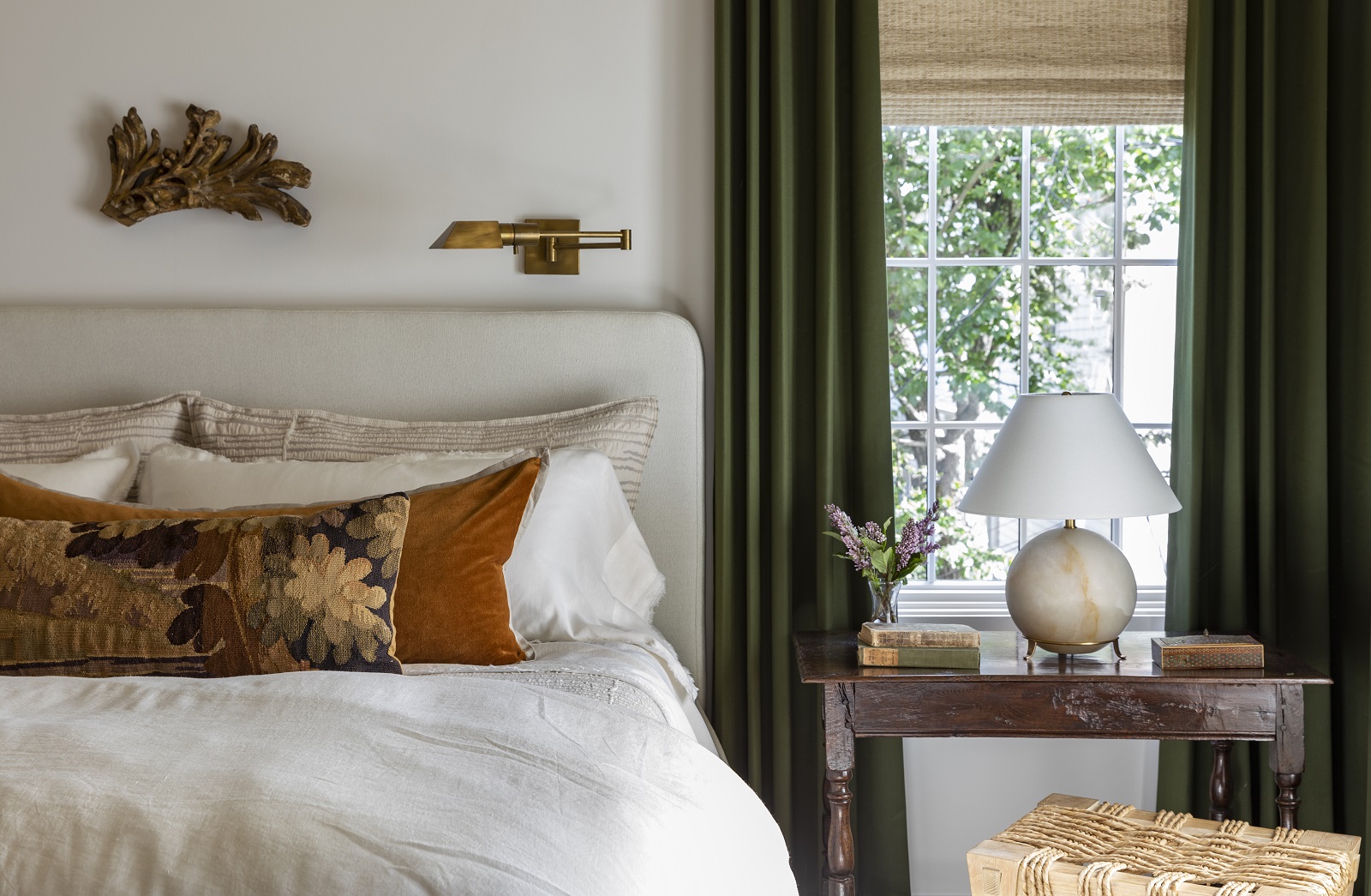
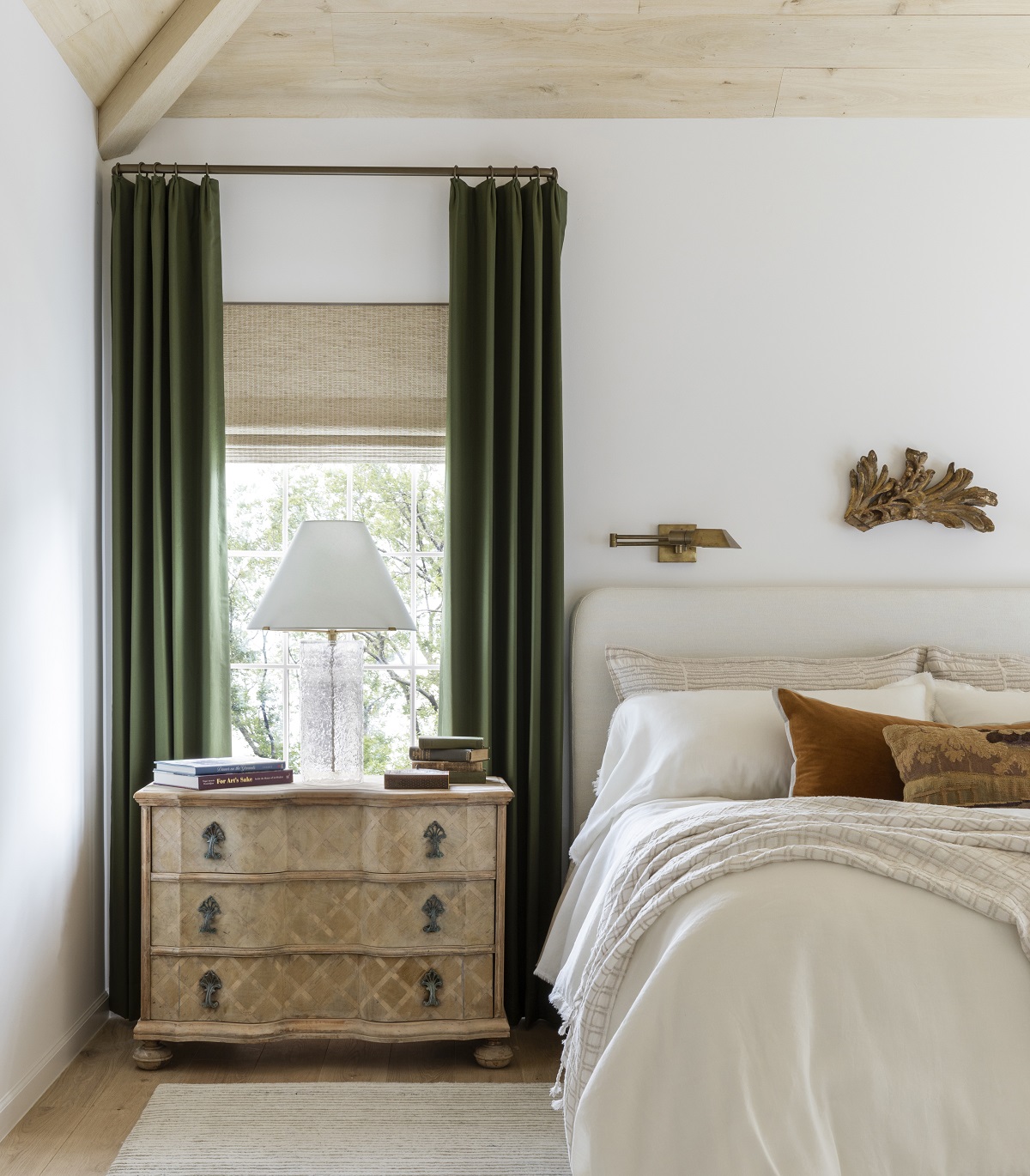
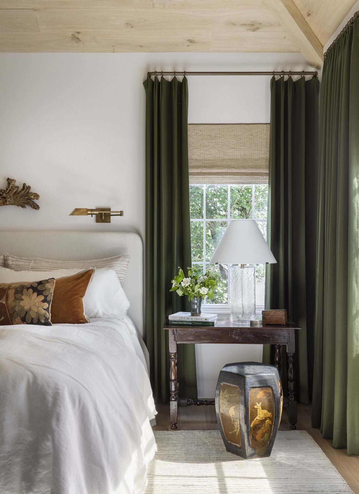
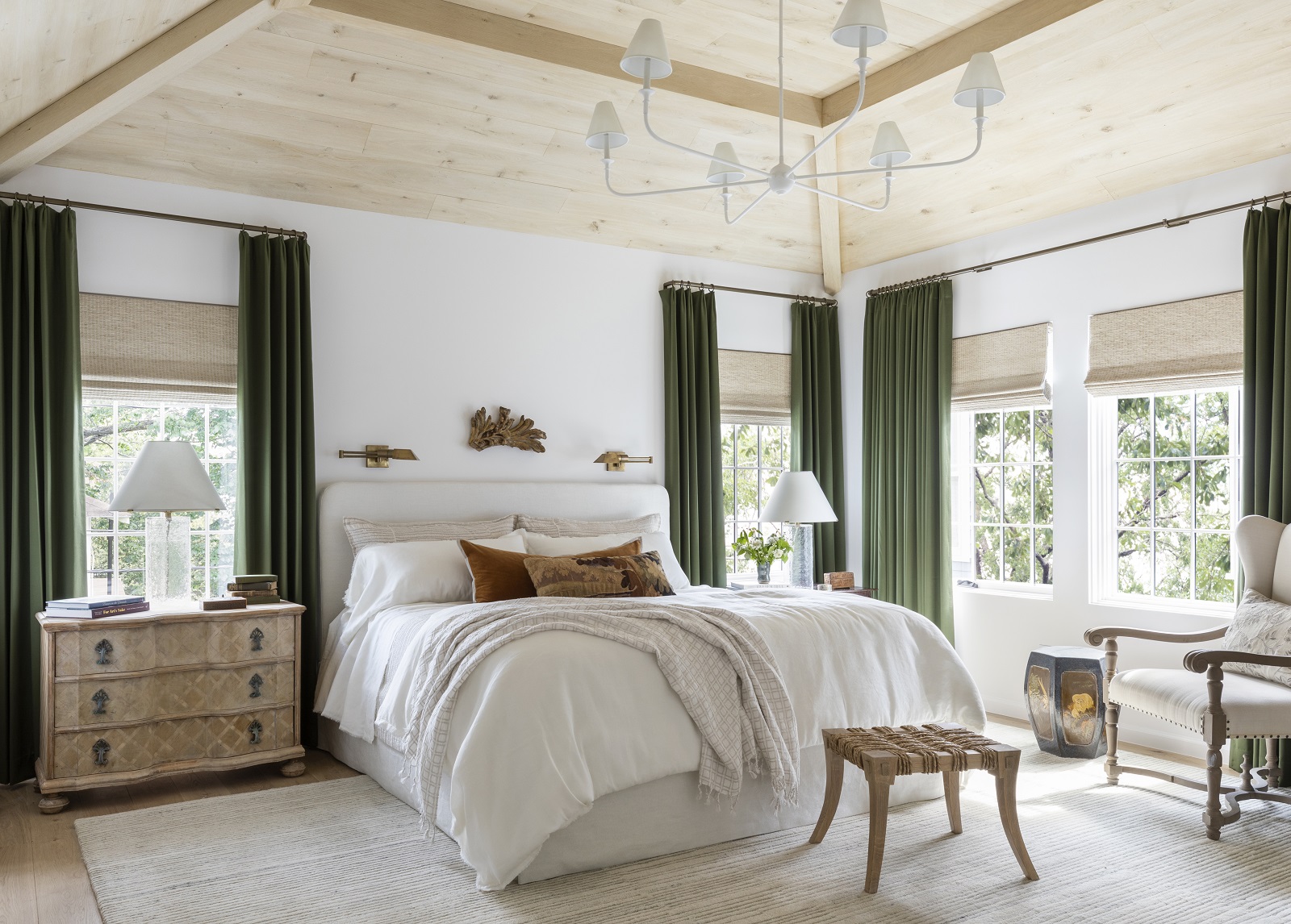
When dreaming up my primary bedroom space I knew I wanted a very natural color palette full of deep, saturated tones. I love the slightly masculine colors of russet and evergreen and took great care to present them in a soft and approachable way. The architect in me knew the white oak ceiling would make the room feel incredibly special and bespoke. Another funny fact is that this is the first king-sized bed that I’ve called my own. I know…I know and it’s been just as life changing as everyone said it would be. This bed was a custom piece made for the space and the fabric is a Mark Alexander linen. Much like the rest of the home, the room’s color is Sherwin-Williams Greek Villa (SW 7551). The bold green of the drapery was another Mark Alexander lambswool satin. I think this bedroom is a great example of how a room can have saturated colors and still feel light and bright. The side tables don’t match, and there’s no rule in any interior design book that says they have to! Both of these side tables are antique which adds character to the space. The rug, bedding and pillows, except for the antique pillow placed in front, are all from my line with Annie Selke and were so much fun to style.
Design Takeaway: Your primary bedroom should truly be a sanctuary. Find what components in a room will help you relax. For example, do you need a designated space for reading? Are there certain colors that enhance your ability to relax? Does a beautifully appointed bed give you daily satisfaction? Think through your priorities for a bedroom and execute accordingly. It’s important to love your room because you spend time there every day! Also, life is too short for scratchy sheets. Invest in a good pair and enjoy them.
Design Sources:
- Bed: Custom
- Fabric on Headboard: Mark Alexander, Loom Jasper White
- Bedding: Marie Flanigan for Annie Selke, Faye Linen in Dove White
- Shams: Marie Flanigan for Annie Selke, Faye Linen in Dove White
- Shams: Marie Flanigan for Annie Selke, Striae Shams in Oatmeal
- Throw Pillow: Marie Flanigan for Annie Selke, Gehry Velvet/Linen Pillow in Caramel
- Throw Pillow with Embroidery: Antique
- Architectural Piece Over Bed: Antique
- Sconces Over Bed: Unknown, Similar Here
- Rug: Marie Flanigan for Annie Selke, Avery Rug in Oatmeal
- Side Tables: Antique
- Table Lamps: Marie Flanigan for Visual Comfort, Driscoll Large Table Lamp and Price Small Table Lamp
- Stool: Custom
- Shades: Hartmann & Forbes, Unity Weave in Common Ground
- Drapery: Mark Alexander, Town in Verde
- Chandelier: Visual Comfort, Piaf Grande Chandelier in Plaster White
- Paint Color: Sherwin Williams, Greek Villa (SW 7551)
- Floors: Stained White Oak
PRIMARY BATHROOM
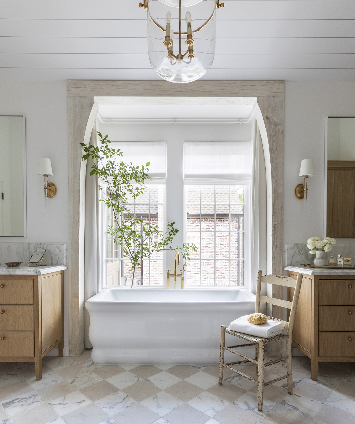
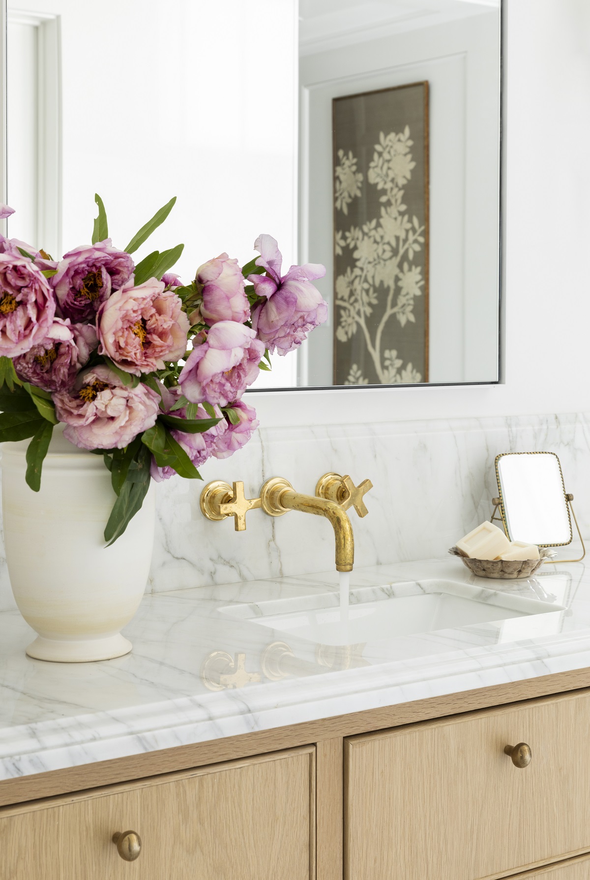
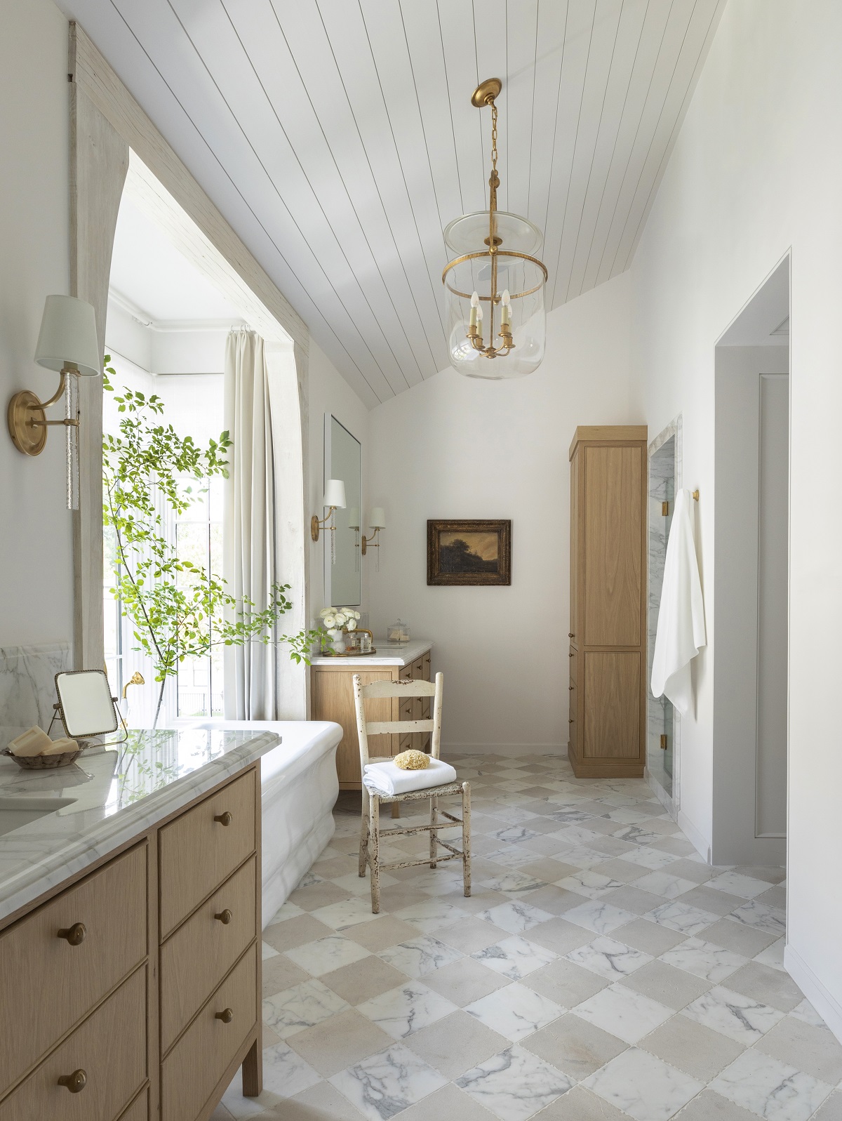
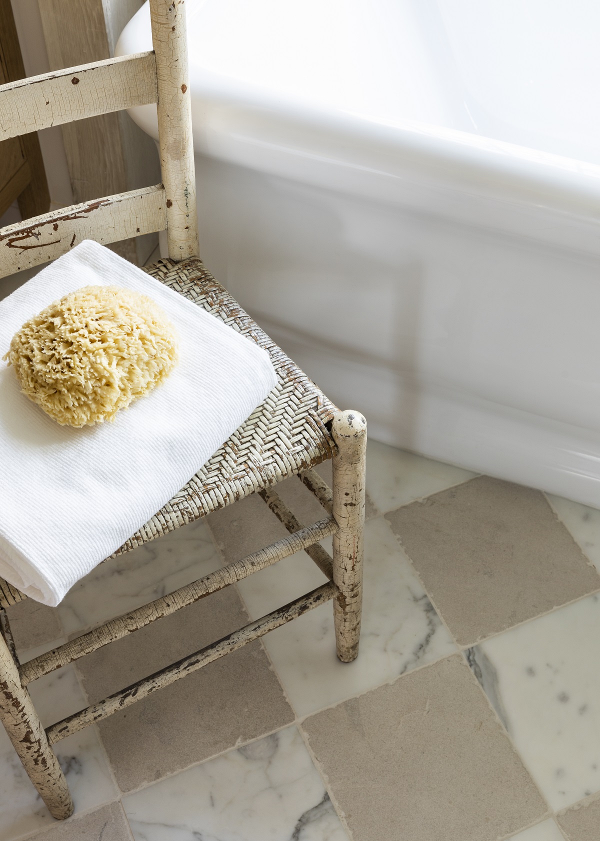
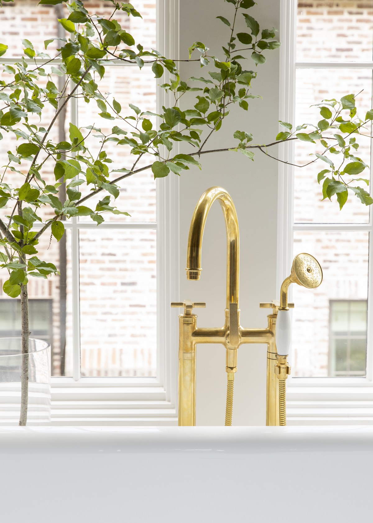
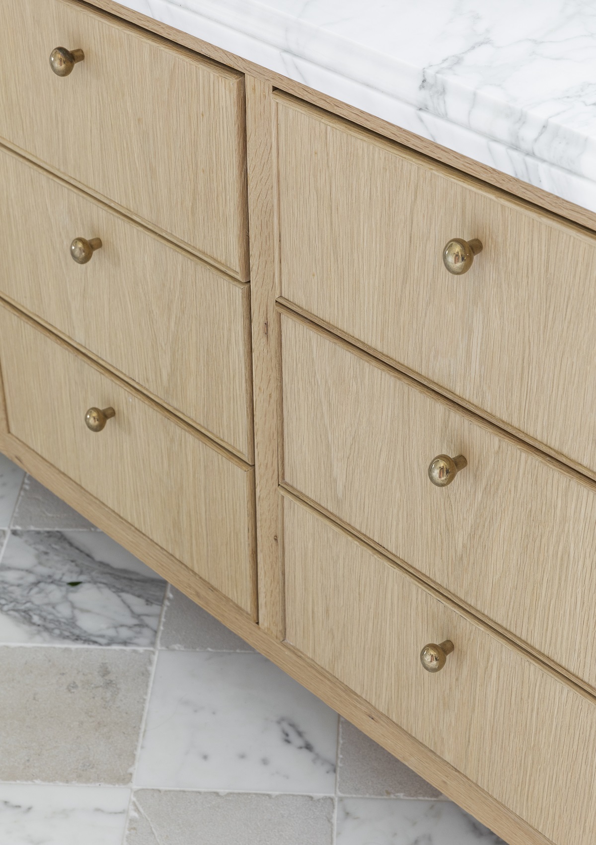
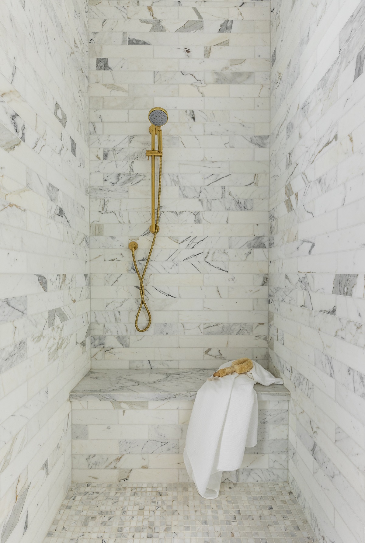
Moving on to the primary bathroom, the drama is in the subtle details of this space. You’ll notice the room is a departure from the saturated primary suite with a mostly white and light palette. I felt like this created a beautiful juxtaposition and transition between spaces. I also changed up the paint color to Sherwin Williams Snowbound (SW 7004). One of the first decisions I made was to incorporate a checkerboard floor. I mixed the Bedrosian calacatta tile, cut it into 9” x 9” squares, with a Material Bespoke limestone which really elevated the space. You’ll notice additional white oak accents throughout, including the casing around the bathtub, built-in and vanities. The touches of unlacquered brass complement the floor’s patina and the Rocky Mountain Hardware Egg Cabinet Knobs are a classic touch. The soaking tub is perfect after a long day of work and the Hartmann & Forbes shades coupled with the light drapery add privacy. If you turn into the opening, you’ll find a shower that leads into the dressing room, which we’ll cover next. Overall, I wanted a space that felt clean, welcoming and admittedly, a bit feminine.
Design Takeaway: Good natural light is essential in a bathroom. Always consider what time you’re getting ready and where the sunlight will be coming from. For me, I love that the morning light comes in through the windows and provides beautiful illumination for makeup application. Thinking through sunlight is incredibly important in all home designs and renovations.
Design Sources:
- Flooring: Bedrosians, Calacatta Marble
- Flooring: Material Bespoke, Paloma Limestone with Old French Quarter Edges
- Hardware: Rocky Mountain Hardware, Egg Cabinet Knob in Silicon Bronze Light
- Tub: Maidstone from Elegant Additions, Kent 67” Matte White Acrylic Double Ended Tub
- Tub Filler: California Faucets, Traditional Floor Mount Faucet in Burnished Brass
- Light Fixture: Visual Comfort, Lorford Smoke Bell Lantern in Gilded Iron
- Vanities: Custom
- Surface: Omni Surfaces, Calacatta Honed
- Sconces: Marie Flanigan for Visual Comfort, Abigail Sconce in Soft Brass
- Mirrors: Custom
- Faucets: California Faucets, Rincon Bay Lavatory Faucet in Burnished Brass
- Accent Chair: Antique
- Paint Color: Sherwin Williams, Snowbound (SW 7004)
- Shower Tile Surround: Bedrosians, Calacatta 3″ x 12″ Honed Marble Tile
DRESSING ROOM
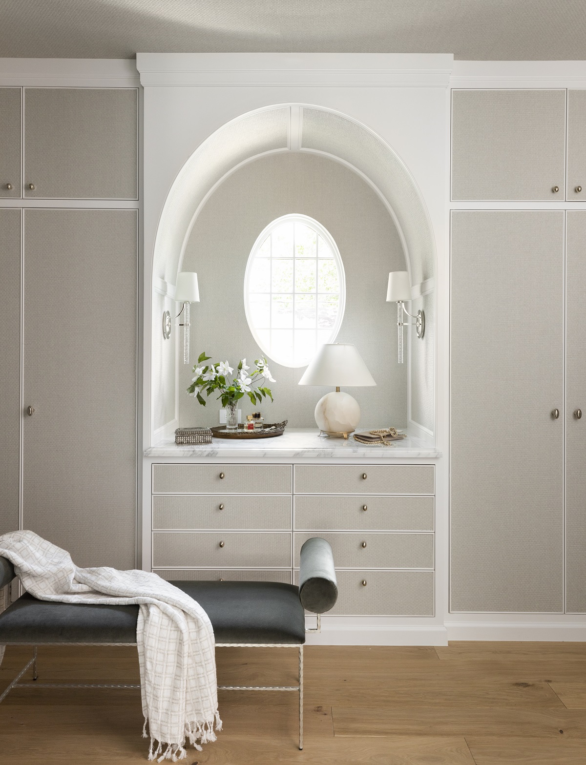
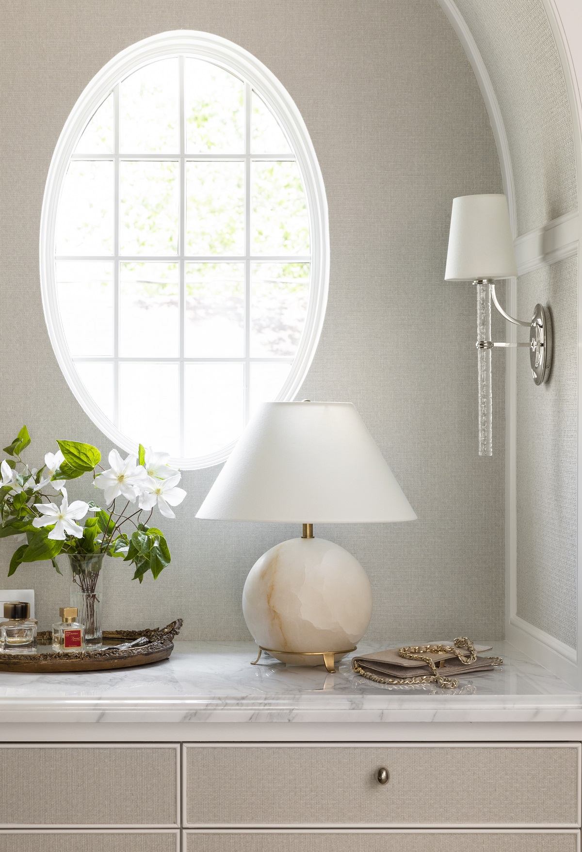
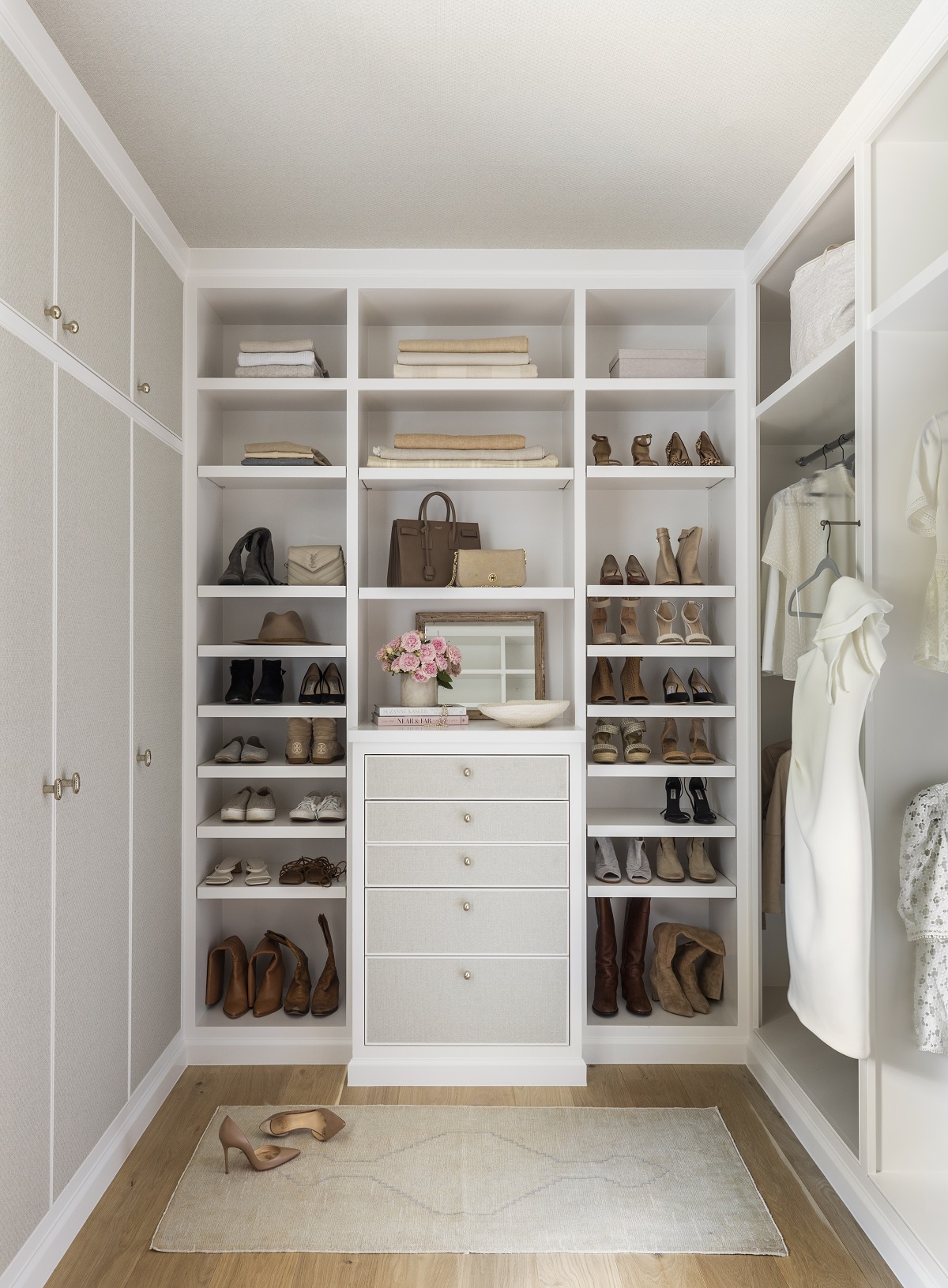
Including a custom closet and dressing room in my home design was a real pinch me moment! I’ve designed so many of these rooms for clients that I understood how I wanted to maximize my storage and space. First, upon entering you notice the sweet oval window which is also found in our dining room, an architectural detail that I love. The window alcove mimics that curve and there is a bank of drawers below. Drawers are essential to how my husband and I like to keep organized, making them a must-have item. I do love a beautifully styled display and this was an opportunity to create a surface for grab-and-go items. The countertop is the same as the primary bath countertop. If you look closely, you’ll notice that the cabinetry has a wall covering on the front of all drawers and cabinets. I picked this Mark Alexander Shifu paper for the soft tones and gorgeous texture. I felt like the wall covering really dressed up the space and was a fun twist on traditional closet millwork. You’ll also notice that I carried it onto the ceiling as well. The hardware is the same Rocky Mountain Hardware that is found in the bathroom. I also kept most of the cabinetry closed, except for a few hanging spaces, which helps me create a clean aesthetic. As a mom on the go, I can assure you I need to keep the cabinets closed!
Design Takeaway: Closet spaces and how they function are so, so personal. I’ve had clients who prefer totally open shelving and hanging space so they can see their clothes. Some clients require very little display space, while some have purse collections that dictate display storage. Before you design your space, think about what’s in your closet and how you want to store it.
Design Sources:
- Millwork Wall Covering: Mark Alexander, Shifu in Stone
- Hardware: Rocky Mountain Hardware, Egg Cabinet Knob in Silicon Bronze Light
- Bench: Perigold, No Longer Available
- Throw: Marie Flanigan for Annie Selke, Caldwell Throw in Plaster
- Sconces: Marie Flanigan for Visual Comfort, Abigail Sconce in Soft Brass
- Paint Color: Sherwin Williams, Snowbound (SW 7004)
JOE’S OFFICE
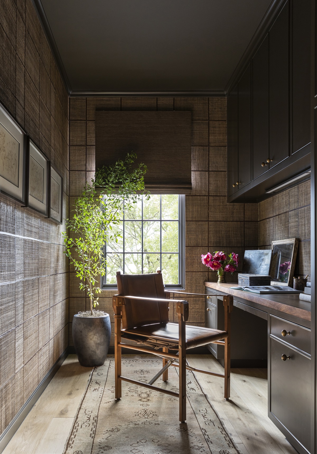
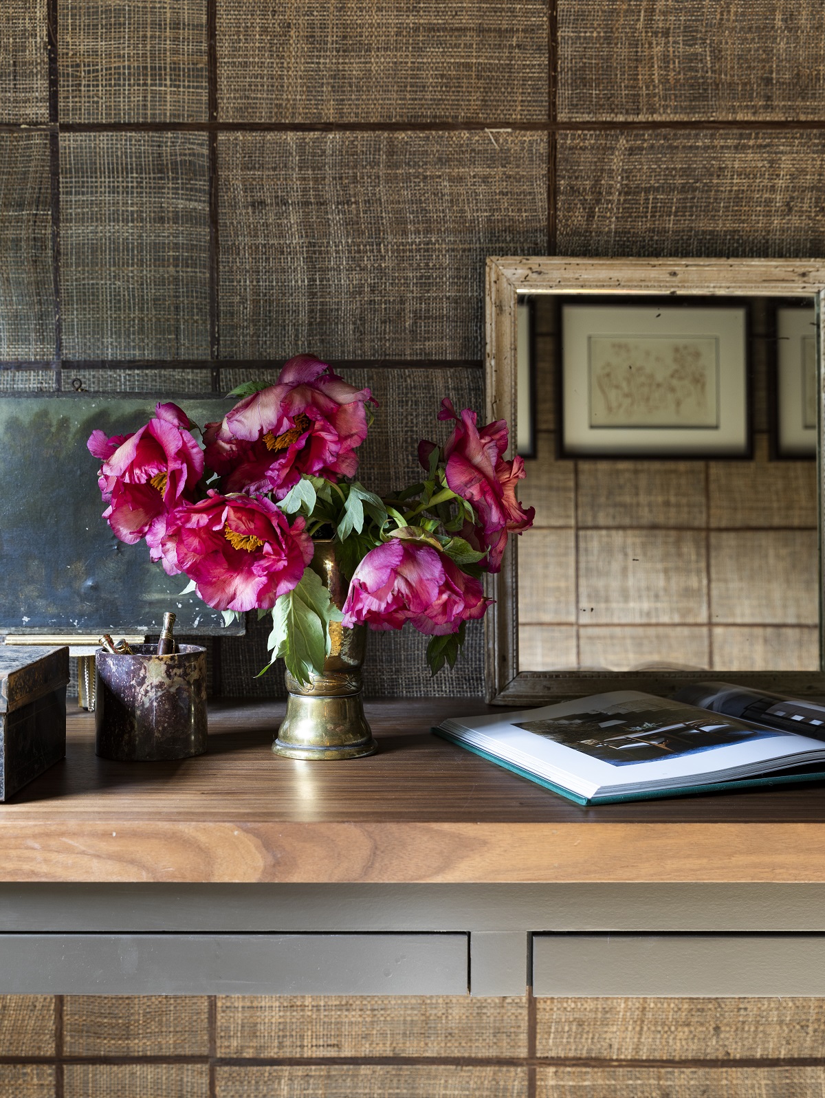
This office space is located on the same side of the house as the primary suite. I loved creating this little annex as it’s a great space to escape the hustle and bustle downstairs. This room is another jewel box space that I had a lot of fun designing. As I’m in the office everyday, Joe works from home and this serves as his office space, so I wanted a really neat masculine vibe. First, the Mark Alexander Grid in Chestnut is such a stunning wall covering. Then, I moved onto the color of millwork which is Sherwin Williams Dark Clove (SW 9183) and complements the wall covering perfectly. I love the simplicity of the Rocky Mountain Hardware Front Mounting Sash Cabinet Pull. Also, is there anything more masculine than a safari chair? The leather and wood was a perfect pick for this space.
Design Takeaway: By placing this office near the primary suite it can actually be dual purpose. When drawing out plans, I accounted for this space to double as a “his” closet. For the season of life that we’re in with three kids at home and both entrepreneurs, we needed an additional office space, but I love flexibility in design.
Design Sources:
- Wall Covering: Mark Alexander, Grid in Chestnut
- Paint: Sherwin Williams, Dark Clove
- Hardware: Rocky Mountain Hardware, Front Mounting Sash Cabinet Pulls
- Chair: Palecek, Expedition Arm Chair
- Shades: Hartmann & Forbes, Woven-to-Size Grassweave in Borato
- Rug: Antique
Well, we did it! My home’s entire interior and all sources are all shared and accounted for. I hope you’ve enjoyed the tour! Don’t worry, we’ve got one more reveal coming up with all of the exterior details from light fixtures to paint colors. Just in time for spring!
