B&A: Royal Point Entry, Dining and Living
You’ve seen our Royal Point project on the pages of House Beautiful and on our blog. Now, we’re taking you room by room to show you more of the detailed finishes that took this house from a dated 90s design to an updated yet traditional aesthetic. When purchased by the homeowners, the home itself was reminiscent of an opulent Mediterranean-inspired home. Lots of dark, carved wood moldings felt heavy throughout its 8,000 sq. ft. The homeowners’ goal was to refresh the home, giving it a light and bright feel that suited their family of six.
We’re excited to show you the before-and-after photos of each space! Be sure to scroll through to see the stunning transformation.
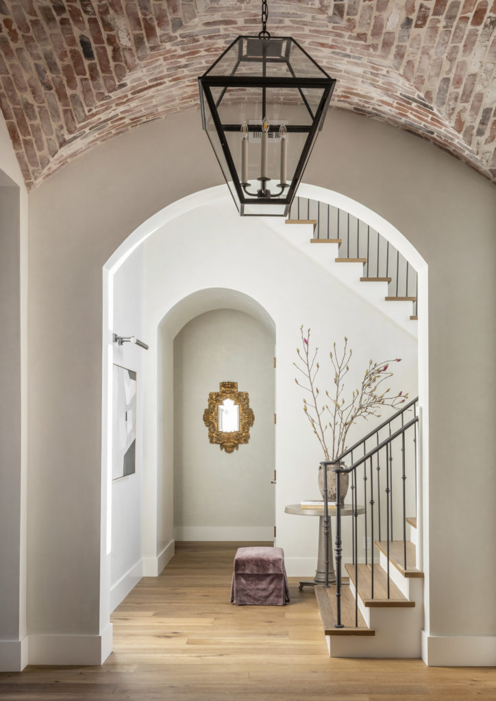
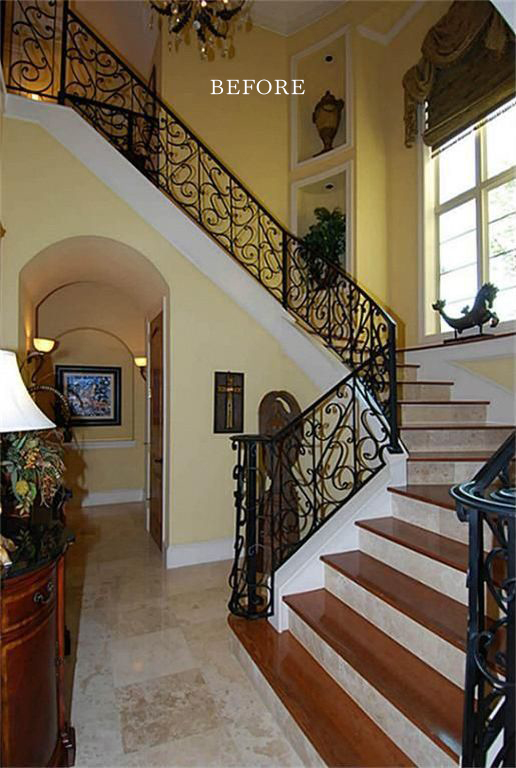
Royal Point Entry
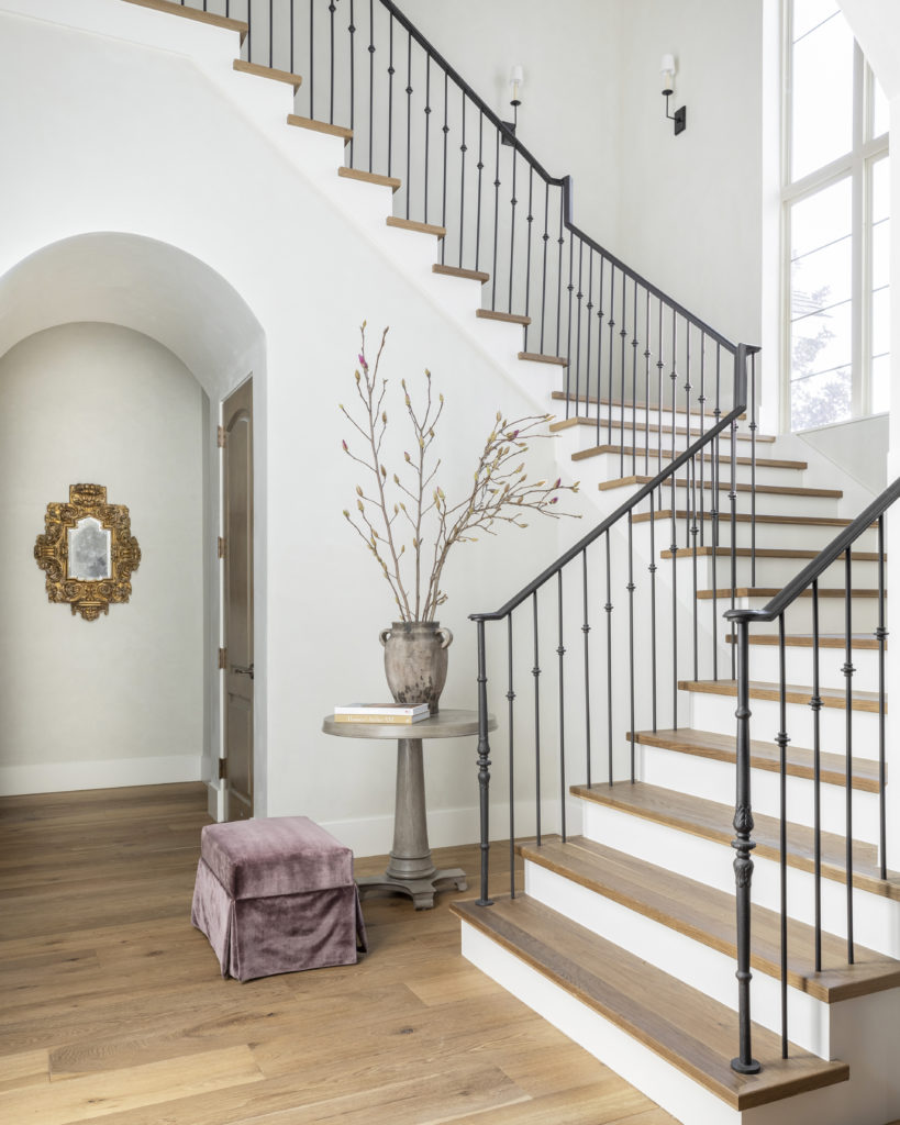
Creating a welcoming sense of home was paramount to the homeowner’s vision. The couple shares New Jersey roots, so we used exposed antique brick on the entryway’s ceiling as a slight nod to their home state. A central Paul Ferrante lantern hangs above and the stunning staircase to the second floor is just to the right of the front doors. Nestled in the curve of the staircase are an elegant pedestal table and a lavender velvet footstool. To add interest to the alcove, an antique mirror sourced in Round Top hangs on the far wall. You’ll notice in the before photos that the arches in the entryway remain intact but now suit the home’s updates. The plastered walls set the tone for the rest of the house. In addition, beautiful hand-scraped white oak and sophisticated iron railings update the stairs.
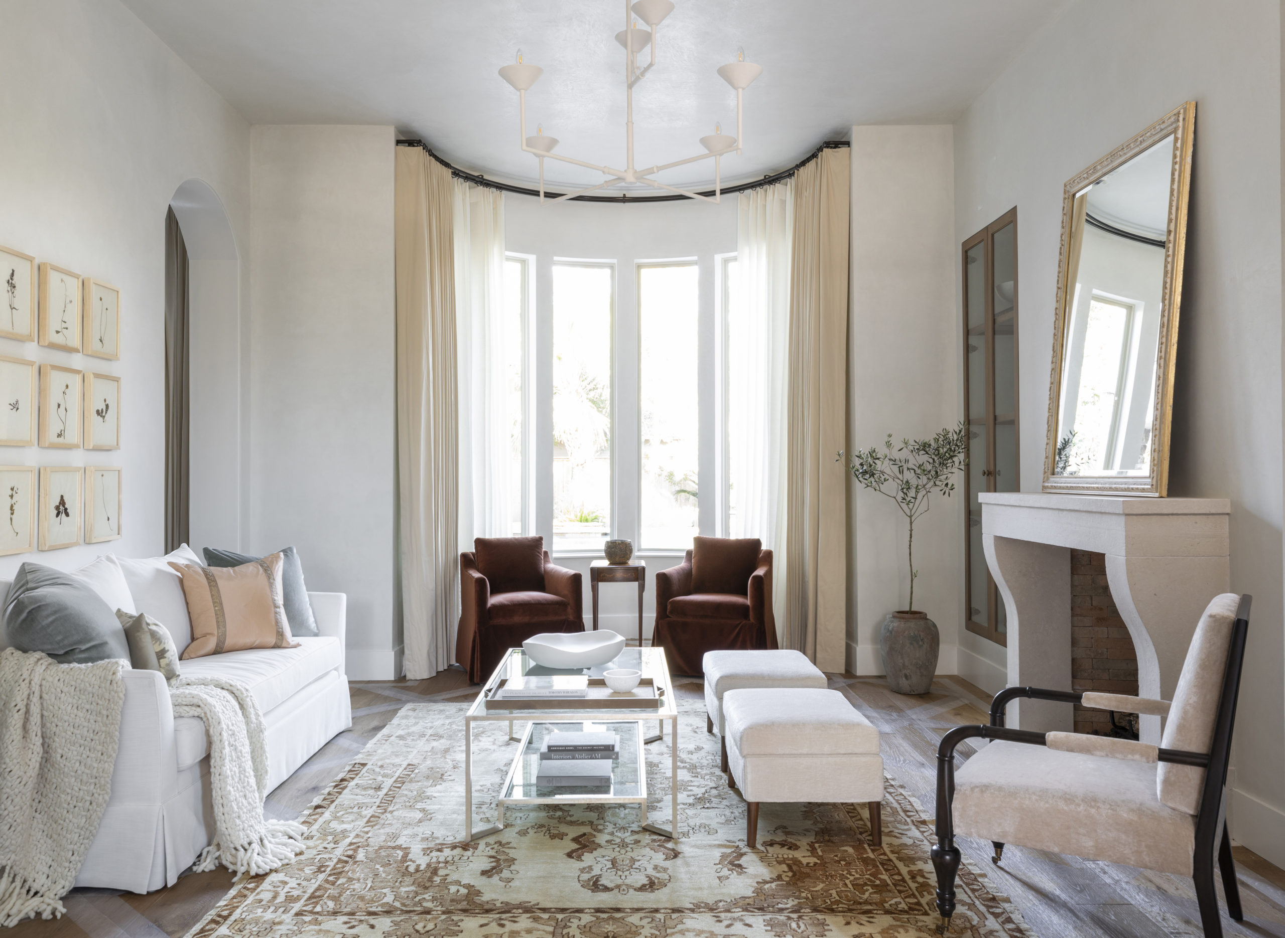
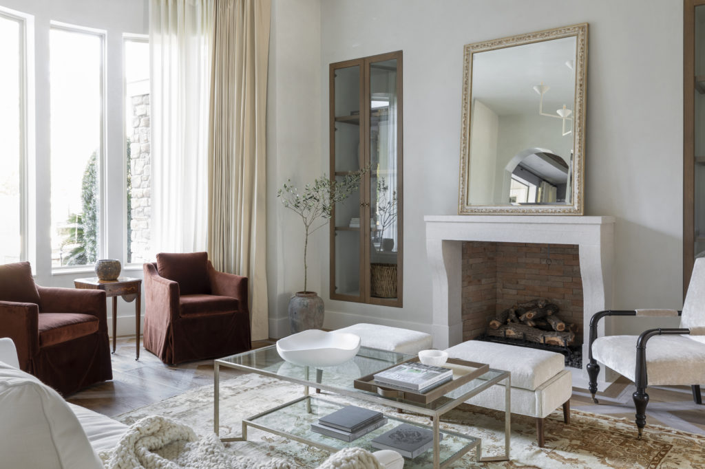
Formal Living Room
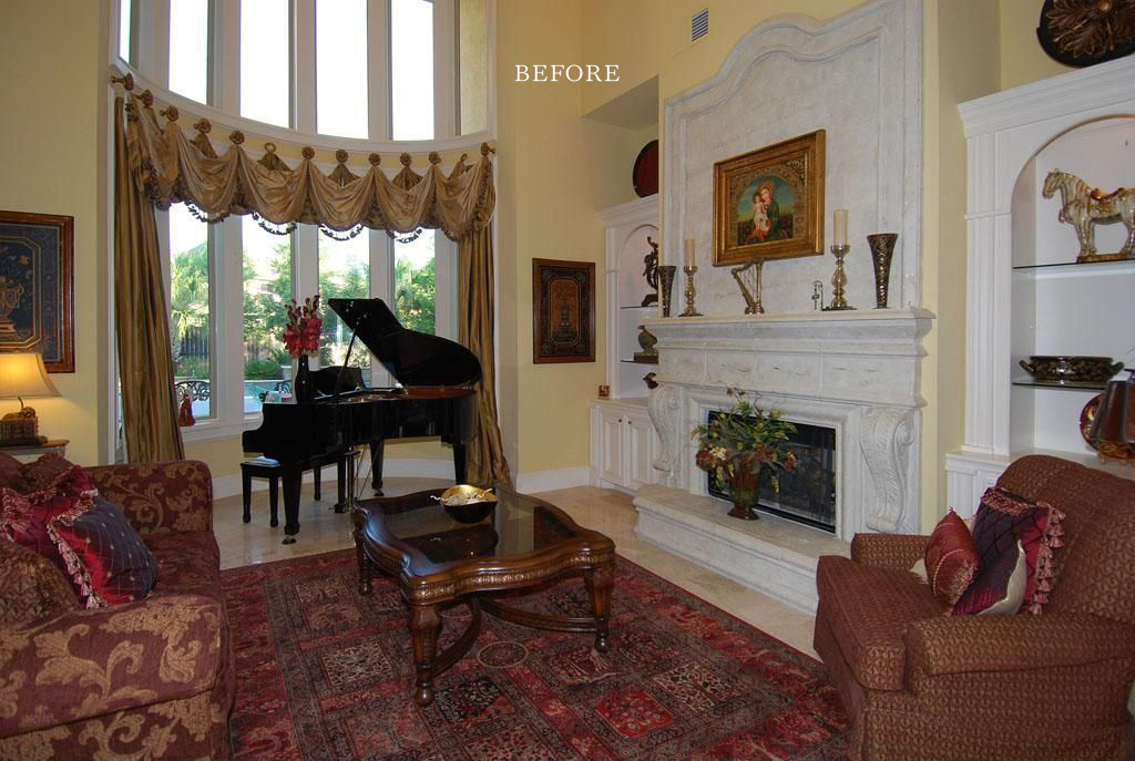
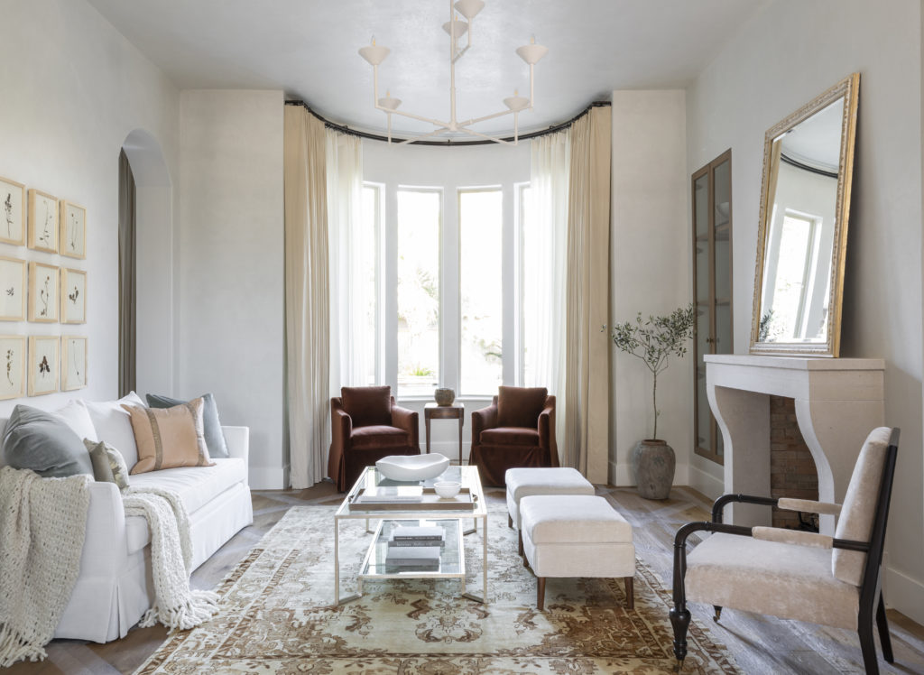
In an almost unrecognizable transformation, the once heavy and grandiose formal living room now is an intimate and inviting space. The homeowners wanted this room to be approachable and comfortable, serving as an additional entertainment annex. To do so, a new ceiling makes the room a single story. This architectural change made the formal living room less intimidating while maximizing space by adding an additional room to the second story.
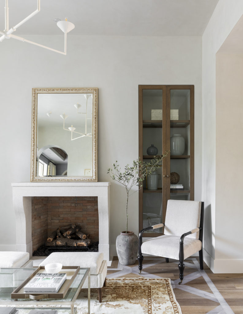
Further, the ornate and dated built-ins were removed and walls were plastered. The redone fireplace includes antique limestone and new rift sawn white oak cabinetry with glass panels flanking it. An oversized antique mirror from Back Row Home sits atop the mantle while ethereal sheer drapery highlights the room’s bay window. A Julie Neill plaster chandelier lights the room. Doro’s Unique Flooring mixed a custom paint color to accent the trellis pattern on the floor. This custom paint accent also carries to the dining room.
Royal Point Dining Room
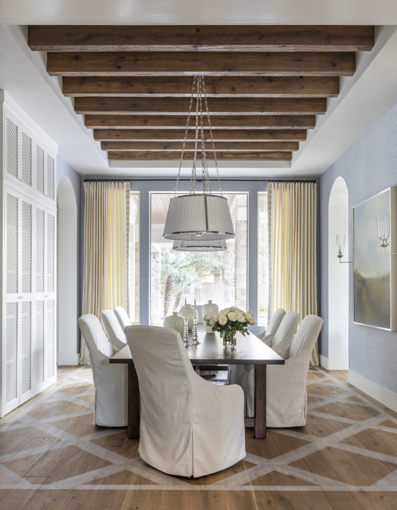
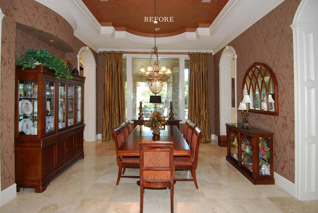
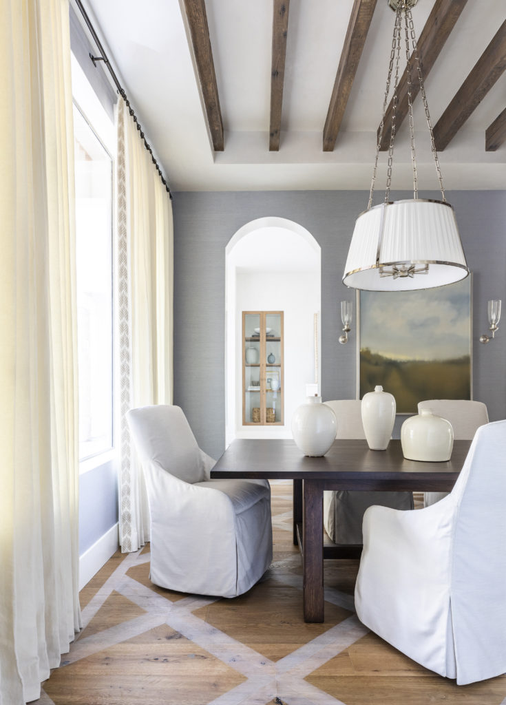
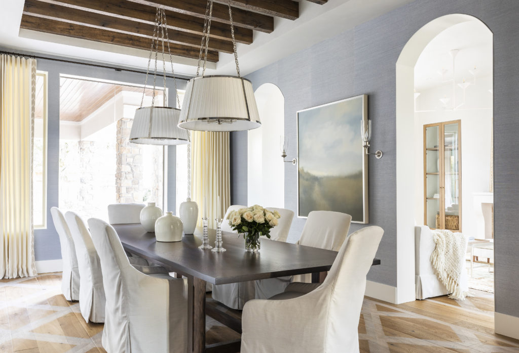
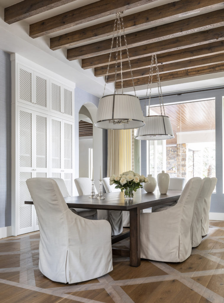
In a similar vein to the original formal living, the dining room was full of bold jewel tones, tile floors, and a tray ceiling. To update the area, the tray ceiling inversions were filled in and replaced by beautiful, reclaimed purlins. The additional wall alcove that previously housed a China cabinet was turned into a thoughtful built-in to provide additional storage. You’ll notice a continuation of the formal living room’s trellis painted floors throughout the dining room. The Phillip Jeffries Manila Hemp wallcovering adds texture to the space. Additionally, Kevin Gillentine’s stunning Wildflower Meadow Study serves as a beautiful focal point. Lee Industries chairs surround a custom dining table, which is long enough to host the clients’ extended family and friends.
We loved this Royal Point project because it truly allowed us to rethink existing spaces and how they function. It’s always interesting to look back and see how design and interiors have changed significantly in the last 30 years. Specifically, this house is from the 90s. We’re excited to continue our tour of this home and next we’ll be sharing the kitchen, living room, sitting room, wine room and mom cave. Stay tuned!
To see more of each space, keep scrolling!

[…] love Royal Point’s continued transformation. If you haven’t already, be sure to check out part one of our tour that includes the entryway, formal living room and dining […]
[…] closets. You’ll continue to notice light and bright color palette seen throughout Part 1 and Part 2 are carried out through these spaces as […]
[…] please. For additional Royal Point context and jaw-dropping transformations, be sure to visit Part 1, Part 2 and Part 3 and keep scrolling for a few more special […]